
Abello Mel: A Fresh Approach to Branding and Packaging Design
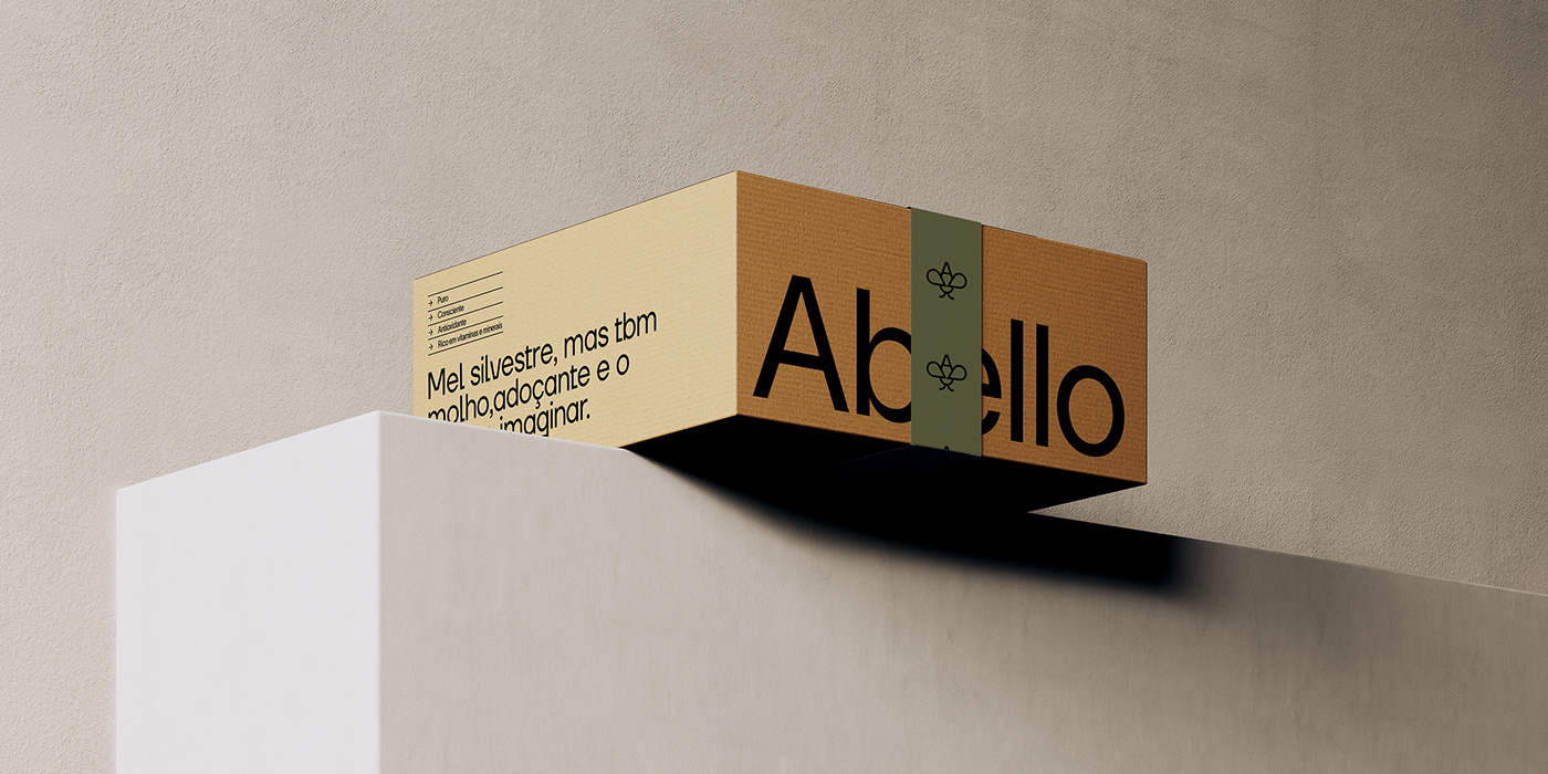
Take a dive into the world of Abello Mel, a groundbreaking honey brand that redefines the way we perceive and experience this timeless food staple. Created by Sweety & Co., Abello Mel takes a fresh and minimalist approach to branding and packaging design, making it appealing to the modern consumer. This innovative brand seamlessly blends tradition with contemporary aesthetics, turning honey into not just a kitchen essential, but a lifestyle statement. Discover how Abello Mel revolutionizes honey consumption and captivates consumers with its sleek and impactful visual identity.
This image is property of lh7-us.googleusercontent.com.
Insights
1. Reframing Honey
Abello Mel’s branding strategy focuses on reframing honey as an essential wellness product. Taking inspiration from the supplement industry, the brand aims to position honey as a product that is not only delicious but also offers numerous health benefits. By emphasizing the holistic properties of honey, Abello Mel presents it as a must-have item for the modern consumer.
The supplement industry has already successfully entrenched itself in the minds of consumers, who are actively seeking products that promote well-being. Abello Mel effectively taps into this existing desire and positions honey as a natural supplement that can enhance overall health and wellness.
2. Picture-Perfect Honey
Abello Mel’s visual identity goes beyond just being a functional product on the tabletop. The brand’s design and packaging aim to create a visually stunning experience that is Instagram-worthy. The aesthetics of Abello Mel’s honey jars and packaging are carefully curated to appeal to the modern consumer’s desire for beautiful and shareable content.
With its sleek and minimalist design, Abello Mel’s honey effortlessly blends into social media narratives. The brand recognizes that today’s consumers not only seek products for their functionality but also for their ability to make a statement. By creating visually striking packaging, Abello Mel ensures that its honey becomes a decorative piece that can be proudly displayed and shared across various platforms.
3. The Power of Minimalism
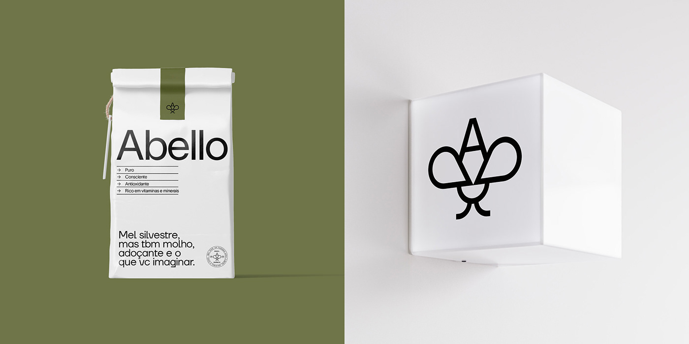
Abello Mel’s brand compositions are characterized by their pristine and minimalist design. In a market saturated with loud and cluttered visuals, the brand’s understated approach stands out. Abello Mel embraces the philosophy of “less is more” and showcases the power of simplicity in creating impactful branding.
The minimalist design of Abello Mel’s branding and packaging ensures that it does not just blend in with other products but rather grabs the attention of consumers. By paring down their design to essential elements, Abello Mel allows the true essence of honey to shine through. This design choice not only aligns with the brand’s contemporary aesthetic but also communicates its commitment to authenticity and transparency.
In summary, Abello Mel’s branding and visual identity serve as an exemplary beacon in design. The brand successfully marries tradition with modernity, transforming honey from a kitchen staple into a lifestyle statement. By reframing honey as a wellness product, creating visually stunning packaging, and leveraging the power of minimalism, Abello Mel offers a fresh approach to branding and packaging design.
This image is property of lh7-us.googleusercontent.com.
Branding and Packaging Design Artifacts
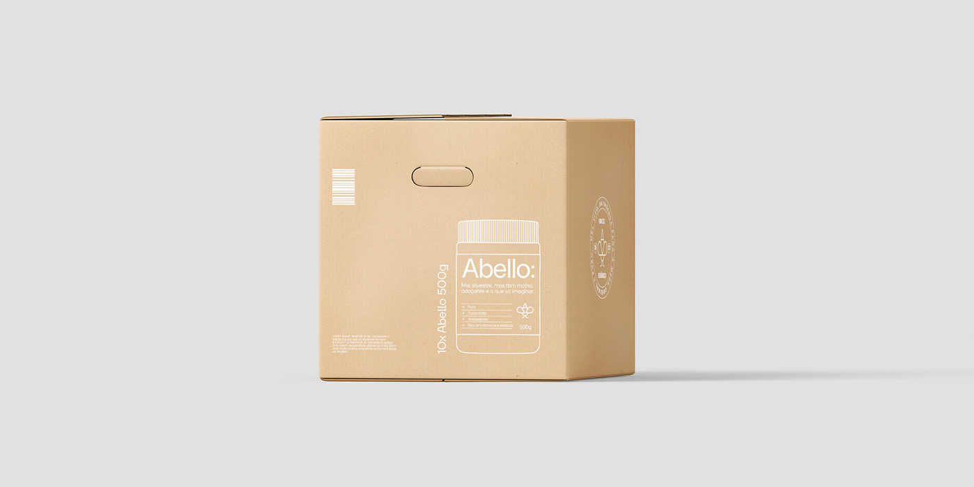
Abello Mel’s branding and packaging design have been carefully crafted to complement its innovative vision. The brand’s dedication to minimalism and contemporary design can be seen in every aspect of its packaging, from the logo to the product labels.
The brand’s logo features a clean, geometric design that embodies simplicity and elegance. The use of lowercase letters adds a modern touch, while the honey droplet icon reinforces the product’s core identity. This logo serves as a visual representation of Abello Mel’s commitment to minimalism and its focus on honey as the main ingredient.
Abello Mel’s packaging design takes inspiration from nature and organic elements. The use of earthy tones, such as green and beige, evokes a sense of natural beauty. The labels feature a minimalist layout, with clear typography and subtle graphics that highlight the purity and authenticity of the product.
The overall aesthetic of Abello Mel’s packaging is designed to create a sense of harmony and balance. The clean lines and minimalistic design convey a feeling of serenity and simplicity, reflecting the brand’s commitment to offering a pure and unadulterated honey experience.
For a more detailed look at Abello Mel’s branding and packaging design, you can visit their Behance profile or explore their official website. These platforms provide a comprehensive showcase of the brand’s visual identity and serve as testaments to its innovative approach to branding and packaging design.
In conclusion, Abello Mel’s branding and packaging design demonstrate the brand’s dedication to reinventing honey for the modern consumer. Through a combination of reframing honey as a wellness product, creating visually captivating packaging, and embracing the power of minimalism, Abello Mel sets itself apart in the market. The brand’s fresh approach to branding and packaging design not only appeals to the contemporary consumer but also elevates honey to a lifestyle statement.
This image is property of lh7-us.googleusercontent.com.
Source: https://abduzeedo.com/abello-mel-fresh-approach-branding-and-packaging-design