

Branding and Visual Design: Studio Fabio Biesel Crafts Identity for Kriste Ceramics
Step into the world of Kriste Ceramics, where nature’s tranquility meets the precision of ceramic artistry. Studio Fabio Biesel, a design studio renowned for their innovative creations, has expertly crafted an identity for Kriste Ceramics that beautifully captures the essence of this unique brand. By combining organic shapes and textures reminiscent of the sea’s surface, Studio Fabio Biesel has created a visual language that speaks to the heart of Kriste’s work. Dive into this captivating article to explore the intricate details of this stunning collaboration and discover how Studio Fabio Biesel has brought forth an identity that resonates with the artist’s personal journey and the enchanting beauty of ceramic art.
This image is property of lh3.googleusercontent.com.
Crafting a brand identity for Kriste Ceramics
When it comes to crafting a brand identity, Studio Fabio Biesel understands the importance of combining the essence of an artist’s work with a visual language that speaks to its audience. Their recent project for Kriste Ceramics exemplifies this delicate balance.
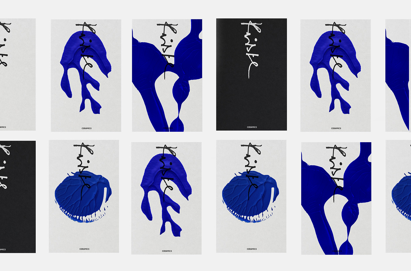
Kriste Tillmann, the mastermind behind Kriste Ceramics, is a talented artist from Germany. Her work beautifully combines the tranquility of the sea with the contrasting elements of organic forms and angular ceramic materials. Studio Fabio Biesel recognized the significance of these characteristics in Kriste’s work and set out to create an identity that would resonate with her personal journey and unique artistic style.
Understanding Kriste Tillmann’s work and inspiration
To effectively capture the essence of Kriste’s work, it was crucial for Studio Fabio Biesel to truly understand her artistic process and sources of inspiration. Kriste draws inspiration from the sea, infusing her pieces with a sense of calm and fluidity. This inspiration is evident in the organic forms and textures that can be seen in her ceramic creations. By immersing themselves in Kriste’s work, Studio Fabio Biesel was able to gain a deep understanding of her artistic vision and translate it into a cohesive brand identity.
This image is property of lh6.googleusercontent.com.
Design philosophy for the project
Studio Fabio Biesel approached the design of Kriste Ceramics’ brand identity with a clear philosophy in mind. They aimed to blend the elements that Kriste cherishes the most – the memory of the sea and the unique characteristics of ceramic art. By seamlessly integrating these two elements, Studio Fabio Biesel set out to create a visual language that would resonate with Kriste’s target audience and communicate the essence of her work.
Visual elements representing the sea and ceramic art
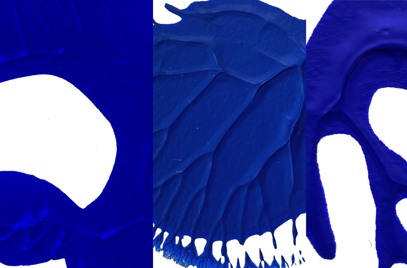
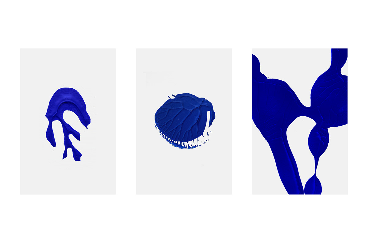
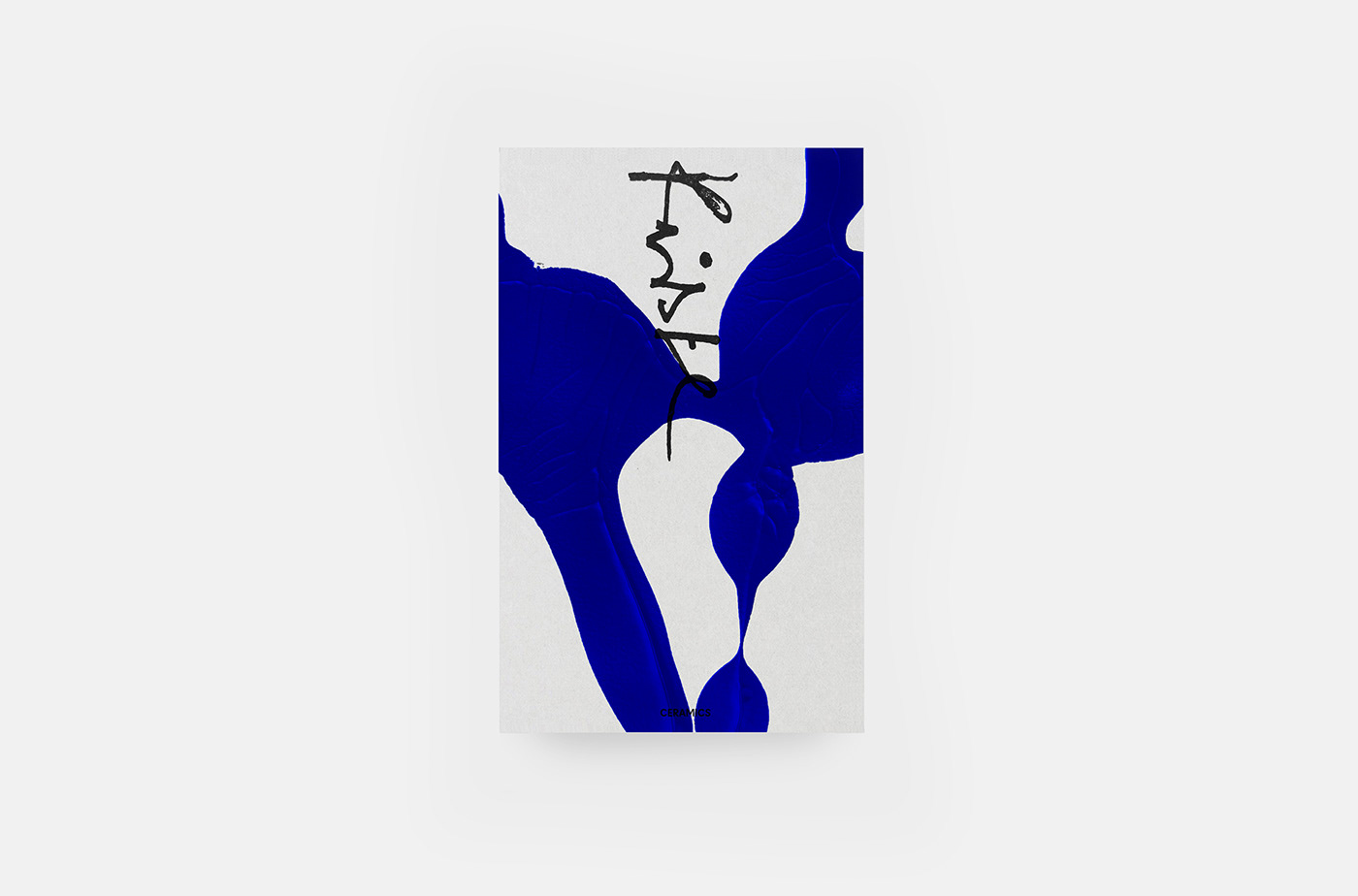
To effectively capture the essence of both the sea and ceramic art, Studio Fabio Biesel utilized visual elements that evoke a sense of tranquility and fluidity. Organic shapes and textures that mimic the surface of the ocean became the primary visual elements in the brand identity. These textures, when observed closely, tell stories of waves, ripples, and the serenity one finds by the shoreline. By incorporating these elements, Studio Fabio Biesel successfully conveys the inspiration behind Kriste’s work and creates a visual identity that is both captivating and cohesive.
This image is property of lh6.googleusercontent.com.
Creating a sense of vastness and depth
One of the key aims of Studio Fabio Biesel in this project was to recreate the vastness and depth of the sea in the visual identity for Kriste Ceramics. By utilizing organic shapes and textures that resemble the surface of the ocean, they were able to create a sense of infinite space and depth. This approach not only pays homage to Kriste’s inspiration but also adds a layer of intrigue and exploration to the brand identity. It invites the audience to immerse themselves in the world of Kriste Ceramics and discover the beauty that lies beneath the surface.
Organic shapes and textures
The use of organic shapes and textures is a defining feature of Kriste Tillmann’s work. Studio Fabio Biesel recognized the importance of these elements and incorporated them into the brand identity for Kriste Ceramics. The organic shapes represent the fluidity and naturalness of the sea, while the textures add depth and tactile interest to the visual elements. This combination creates a harmonious and visually captivating brand identity that reflects the spirit of Kriste’s work.
This image is property of lh5.googleusercontent.com.
Tales of waves, ripples, and serenity
The visual elements used in the brand identity for Kriste Ceramics tell tales of waves, ripples, and serenity. They capture the essence of the sea and the tranquility that Kriste infuses into her work. The organic shapes and textures mimic the movement of waves and the gentle ripples on the surface of the water. They create a sense of calm and serenity, inviting the audience to immerse themselves in Kriste’s world. These visual elements become a storytelling tool, conveying the emotions and inspiration behind Kriste’s ceramic art.
The significance of Kriste’s roots
Kriste Tillmann’s roots play a significant role in her artistic journey and the inspiration behind her work. As someone who hails from Germany, Kriste’s connection to the sea runs deep. The brand identity for Kriste Ceramics pays homage to her roots and the seascape that has influenced her artistry. By incorporating visual elements that represent the sea, Studio Fabio Biesel not only captures the essence of Kriste’s work but also honors her personal journey and artistic identity.
This image is property of lh4.googleusercontent.com.
Studio Fabio Biesel’s portfolio and contact details
For a closer look at Studio Fabio Biesel’s work and to explore more of their portfolio, visit their website at STUDIOFABIOBIESEL.COM. You can also find them on Behance, where they showcase their creative projects. If you wish to get in touch with Studio Fabio Biesel, you can find their contact details on their website. They would be happy to discuss any creative endeavors or collaborations.
In conclusion, Studio Fabio Biesel has successfully crafted a brand identity for Kriste Ceramics that captures the essence of her work and resonates with her audience. By understanding Kriste Tillmann’s inspirations, incorporating visual elements representative of the sea and ceramic art, and creating a sense of vastness and depth, Studio Fabio Biesel has created a visually captivating and cohesive brand identity. This brand identity not only reflects Kriste’s artistic vision but also honors her roots and personal journey as an artist. It is a testament to the power of effective branding and the art of crafting a visual language that speaks to the audience.
Source: https://abduzeedo.com/branding-and-visual-design-studio-fabio-biesel-crafts-identity-kriste-ceramics