
Everbloom’s Refined Branding and Visual Identity by Studio 28K
In the vast expanse of the design realm, Studio 28K and Everbloom have joined forces to create a refined branding and visual identity that encapsulates the essence of perpetual growth and self-expression. This collaboration has birthed the EverGrid, a creative framework that harmoniously balances audacity with meticulous composition. The branding, anchored by bold typography and vibrant color choices, reveals layers of complexity upon closer examination. Studio 28K’s strategy shines through in their intentional choices, crafting a visual identity that not only captures attention but also resonates deeply with Everbloom’s mission. With contemporary imagery and a design that is both flexible and consistent, Everbloom’s branding and visual identity by Studio 28K is truly a masterpiece in design thinking.

This image is property of lh6.googleusercontent.com.
Everbloom’s Refined Branding and Visual Identity by Studio 28K
In the vast expanse of the design realm, the marriage of intentionality and creativity births masterpieces. One such collaboration emerged between Studio 28K and Everbloom—a brand ardently journeying towards converting passion and self-expression into tangible opportunity.
Everbloom, in its very essence, is reminiscent of perpetuity—evolving, adapting, and persisting. This dynamic nature of the brand called for an identity that was both malleable yet strong. The answer? The EverGrid. Conceived as an open-ended, creative framework, the EverGrid is not merely a structure; it’s a playground for boundless creativity.
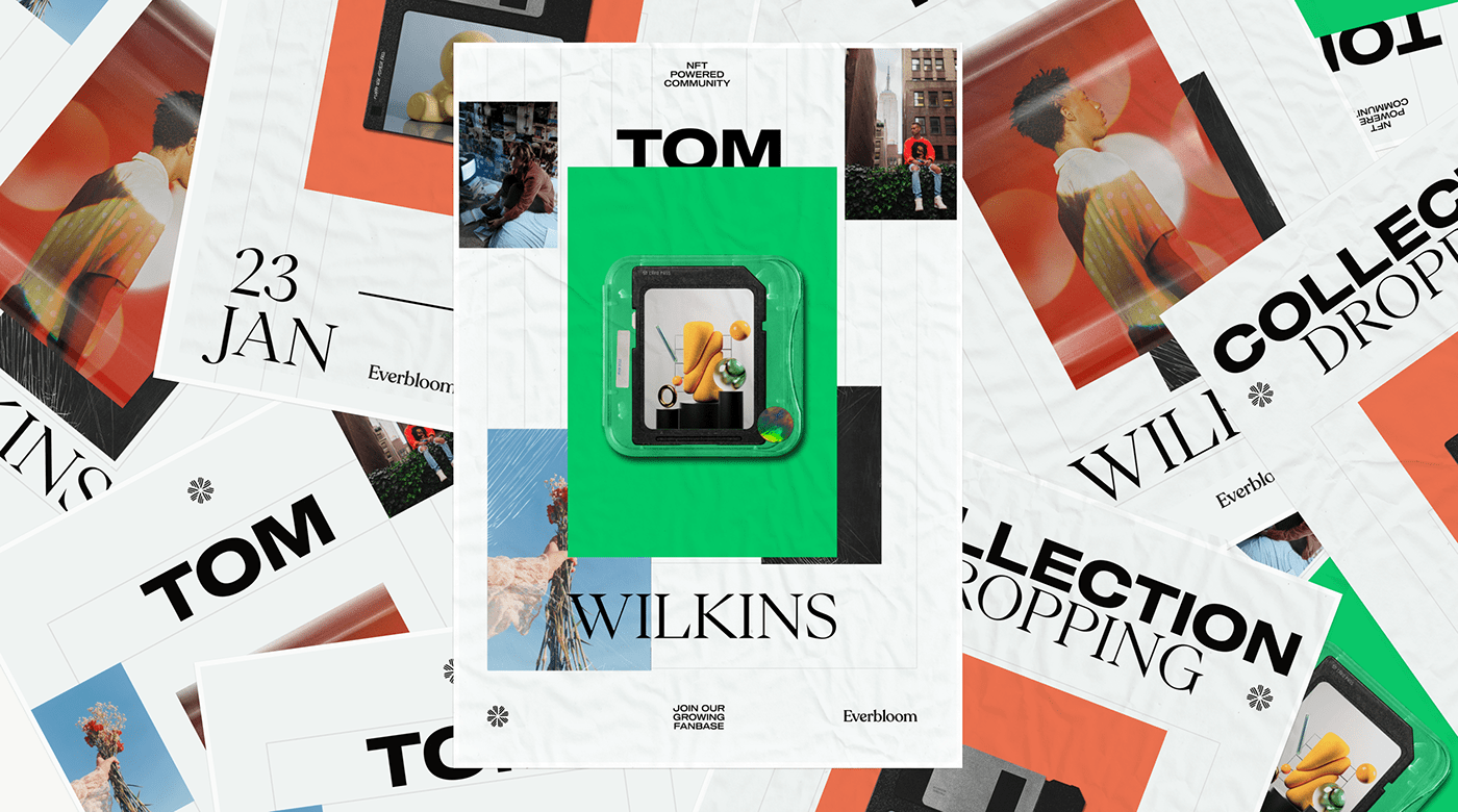
The image attached poignantly captures the quintessence of Everbloom’s branding. The visual identity, while appearing simple at first glance, reveals layers of complexity upon closer examination. The foundation is built on bold typography, which stands out as a testament to the brand’s audacity. This audacity is harmoniously balanced with a meticulous composition, deeply rooted in the principles of a grid system. Such an approach ensures that while the design can be flexible and dynamic, it remains anchored and consistent.
Color choices in branding are never arbitrary. The vibrant shades of green and orange are not just choices; they’re statements. Green, often symbolic of growth, renewal, and energy, resonates with Everbloom’s mission of turning passions into opportunities. The orange, vibrant and attention-grabbing, reflects the brand’s fervor and zest. These vivacious colors, when juxtaposed with the timeless elegance of black and white, create a visual symphony—both fresh and contemporary.
Furthermore, the imagery used is a breath of fresh air. Contemporary, relevant, and striking, it augments the brand’s identity, making it relatable and aspirational simultaneously. Such choices demonstrate the sheer brilliance of Studio 28K’s strategy, which, while rooted in design principles, isn’t afraid to break the mold when necessary.
In conclusion, Everbloom’s branding and visual identity, sculpted by Studio 28K, is a masterclass in design thinking. It’s a narrative of how intentional choices, when coupled with creative liberty, can craft a brand identity that’s not just visually pleasing but also deeply resonant with its ethos. The EverGrid is a testament to that—a framework that’s both structured and free, echoing the very spirit of Everbloom.
Branding and Visual Identity Artifacts
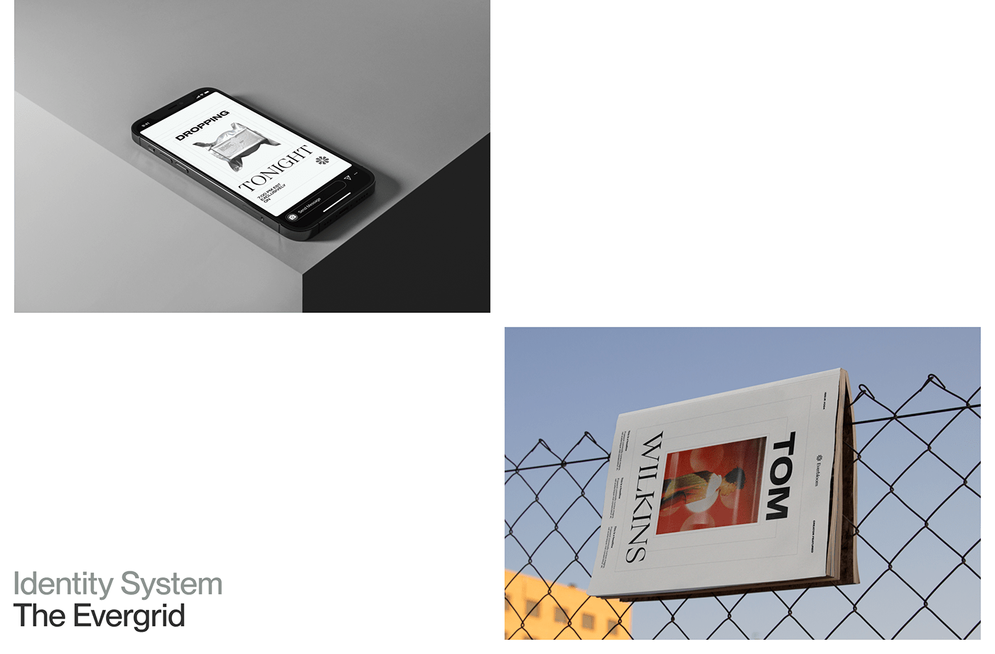
Studio 28K’s work on Everbloom’s branding and visual identity is truly a breathtaking sight to behold. The artifacts created are a testament to their artistic prowess and meticulous attention to detail. From logo designs to typography choices, every element has been carefully crafted to create a cohesive and visually stunning brand identity.
The use of bold typography in Everbloom’s visual identity is both audacious and impactful. It serves as a bold statement that captures the essence of the brand’s mission. The deliberate choice of typography adds a layer of depth and personality to the brand, making it instantly recognizable and memorable.
The color palette chosen for Everbloom’s branding is a perfect blend of vibrancy and sophistication. The use of vibrant shades of green and orange reflects the brand’s energy and passion, while the timeless elegance of black and white adds a touch of class and sophistication. The juxtaposition of these colors creates a visually striking effect that captures attention and leaves a lasting impression.
The imagery used in Everbloom’s visual identity is contemporary, relevant, and visually stunning. It perfectly complements the brand’s mission and values, creating a visual narrative that resonates with the target audience. The careful selection and curation of imagery showcase Studio 28K’s thoughtful approach to visual storytelling.
Overall, the branding and visual identity artifacts created by Studio 28K for Everbloom are a testament to their creative genius and expertise in the field of design. The attention to detail and careful craftsmanship evident in every element make Everbloom’s visual identity truly remarkable.
This image is property of lh3.googleusercontent.com.
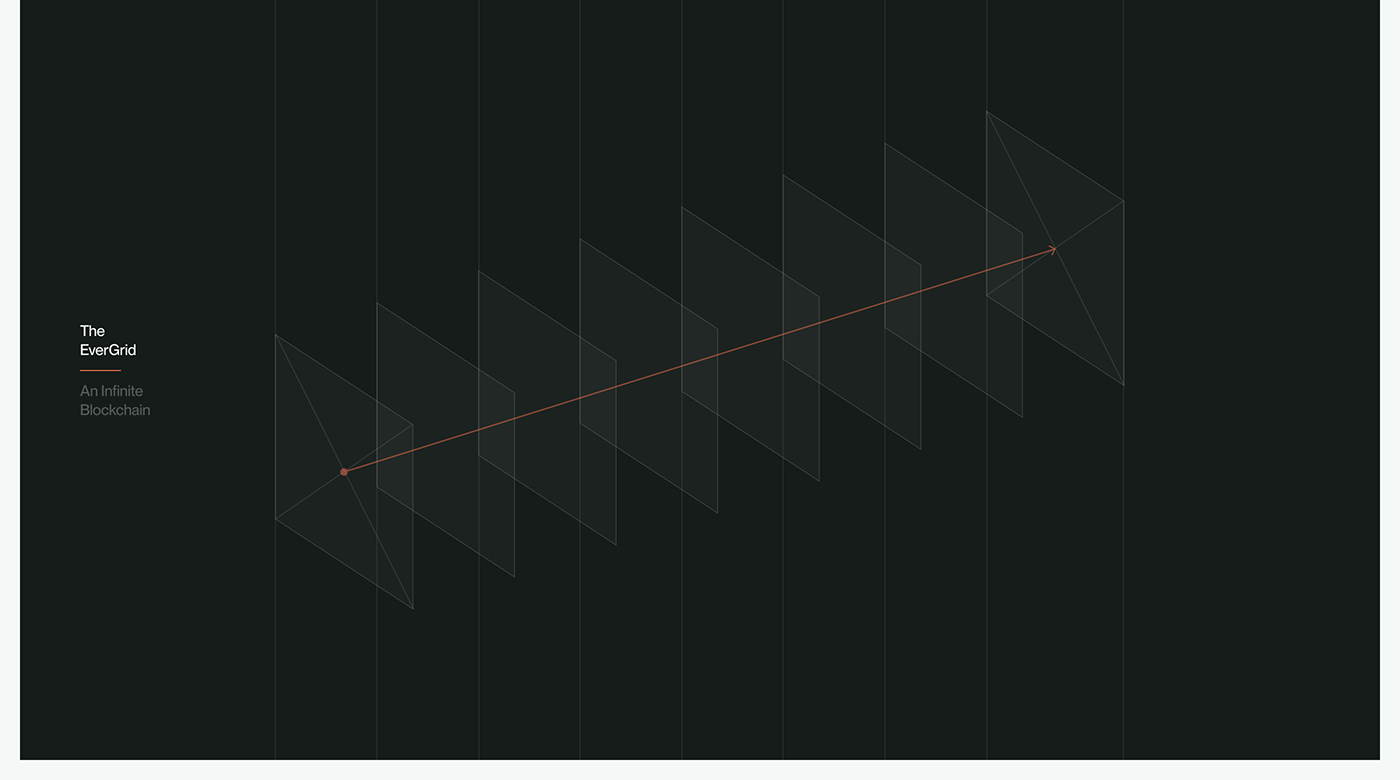
The EverGrid: A Creative Framework
At the heart of Everbloom’s refined branding and visual identity lies the EverGrid—a creative framework that serves as the foundation for the brand’s design elements. The EverGrid is not just a structure; it’s a playground for boundless creativity.
The EverGrid provides a structured framework for designing various elements of Everbloom’s visual identity. It ensures consistency and coherence across different touchpoints, while still allowing for flexibility and customization. This balance between structure and freedom is key to creating a visual identity that is both visually pleasing and representative of Everbloom’s evolving nature.
The EverGrid allows for the easy integration of new design elements and adapts effortlessly to changing needs and trends. It provides a framework for experimentation and exploration, enabling Studio 28K to push boundaries and create innovative designs while still maintaining the brand’s essence.
This creative framework empowers Everbloom to continually evolve and adapt its visual identity without losing its core essence. It serves as a visual backbone that supports the brand’s growth and ensures consistency across different platforms and mediums.
The EverGrid truly embodies the spirit of Everbloom—a brand that is constantly evolving, adapting, and persisting. It is a testament to the power of a well-crafted creative framework in shaping a brand’s visual identity and ensuring its longevity.
Audacity and Meticulous Composition
One of the standout features of Everbloom’s branding and visual identity is the perfect balance between audacity and meticulous composition. Studio 28K has masterfully crafted a visual identity that is both bold and harmoniously balanced.
The audacity of Everbloom’s visual identity is evident in the bold typography choices. The use of strong, striking fonts instantly captures attention and conveys a sense of confidence and fearlessness. This audacity sets Everbloom apart from its competitors and makes a bold statement about the brand’s personality and values.
However, this audacity is not without thought and careful consideration. Studio 28K has ensured that the bold typography is balanced with a meticulous composition deeply rooted in the principles of a grid system. This composition provides structure and coherence to the design elements, making them visually pleasing and impactful.
The grid system ensures that while the design can be flexible and dynamic, it remains anchored and consistent. The careful alignment and spacing of elements create a sense of order and harmony without compromising on creativity and flair.
The audacity and meticulous composition in Everbloom’s visual identity work hand in hand to create a cohesive and visually stunning brand identity. It is this perfect balance between boldness and precision that sets Everbloom’s branding apart and leaves a lasting impression on its audience.
This image is property of lh4.googleusercontent.com.
Symbolism in Color Choices
Color choices play a significant role in shaping a brand’s visual identity, and Everbloom’s branding is no exception. Studio 28K has made deliberate and symbolic color choices that add depth and meaning to the brand’s identity.
The vibrant shades of green and orange used in Everbloom’s visual identity are not just aesthetically pleasing; they carry deep symbolism. Green, often associated with growth, renewal, and energy, resonates with Everbloom’s mission of turning passions into opportunities. It represents the brand’s commitment to nurturing creativity and helping individuals flourish.
The use of orange, a vibrant and attention-grabbing color, reflects the brand’s fervor and zest for self-expression and growth. It symbolizes Everbloom’s passion for empowering individuals to embrace their unique talents and aspirations.
The combination of these vivacious colors with the timeless elegance of black and white creates a striking visual contrast. It represents the duality of Everbloom—the blend of modernity and tradition, of audacity and sophistication. This color palette is both fresh and contemporary, capturing the attention of the audience while still exuding a sense of timelessness.
The deliberate symbolism in Everbloom’s color choices adds depth and meaning to the brand’s visual identity, making it more than just a visual representation. It serves as a reflection of the brand’s values, mission, and ethos, creating a deeper connection with the audience.
Striking and Contemporary Imagery
In addition to typography and color choices, the imagery used in Everbloom’s visual identity plays a crucial role in shaping its overall brand image. Studio 28K has curated a collection of striking and contemporary imagery that perfectly complements the brand’s mission and values.
The imagery used in Everbloom’s branding is contemporary and relevant, reflecting the brand’s focus on staying ahead of trends and embracing innovation. It captures the essence of Everbloom’s target audience and the aspirations they hold. The choice of imagery creates a visual narrative that is relatable and aspirational, resonating with the audience on a deeper level.
The contemporary imagery also showcases the brand’s commitment to progress and growth. It communicates Everbloom’s dedication to staying at the forefront of creativity and fostering a community of forward-thinkers. By featuring imagery that is visually striking and aesthetically pleasing, Everbloom’s visual identity becomes more than just a representation of the brand—it becomes an aspiration for its audience.
Studio 28K’s thoughtful selection and curation of imagery demonstrate their expertise in creating visually impactful designs that capture attention and leave a lasting impression. The imagery used in Everbloom’s visual identity adds depth and context to the brand, making it relatable, aspirational, and visually stunning.
This image is property of lh6.googleusercontent.com.
Crafting a Brand Identity
Crafting a compelling and visually appealing brand identity is no small feat, but Studio 28K has risen to the challenge with Everbloom. Their expertise in design thinking and their creative approach have resulted in a brand identity that is not only visually pleasing but also deeply resonant with Everbloom’s ethos.
The intentional choices made by Studio 28K in crafting Everbloom’s brand identity are evident in every element. From the bold typography to the striking color palette, every decision has been carefully considered to create a cohesive and visually stunning visual identity.
The bold typography choices reflect Everbloom’s audacious nature, while the meticulous composition ensures that the design remains anchored and consistent. The symbolism in the color choices adds depth and meaning to the visual identity, resonating with the brand’s mission and values. The striking and contemporary imagery creates a visual narrative that is relatable and aspirational, capturing the attention of the audience.
Studio 28K’s creative liberty in crafting Everbloom’s brand identity is truly commendable. They have pushed boundaries and broken the mold when necessary, resulting in a brand identity that is both visually pleasing and unique. This creative approach, coupled with their expertise in design thinking, has transformed Everbloom’s visual identity into a masterclass in brand crafting.
The Brilliance of Studio 28K’s Strategy
Studio 28K’s strategy in creating Everbloom’s refined branding and visual identity is nothing short of brilliant. Their approach combines intentionality with creative liberty, resulting in a brand identity that is both visually stunning and deeply resonant.
The strategy employed by Studio 28K is rooted in design principles and built upon a solid foundation of research and understanding of Everbloom’s mission and values. This in-depth knowledge allows them to make intentional choices that reflect the brand’s essence, ensuring a cohesive and impactful visual identity.
However, Studio 28K is not afraid to deviate from the norm and break the mold when necessary. Their creative liberty enables them to explore new ideas and push boundaries, resulting in a brand identity that is unique and stands out from the competition. This balance between intentionality and creative freedom is key to creating a brand identity that is visually appealing, memorable, and resonant with the audience.
Furthermore, Studio 28K’s strategy is guided by a deep understanding of Everbloom’s target audience. Their research and analysis inform every design decision, ensuring that the brand identity speaks directly to the aspirations and desires of its audience. This insight allows Studio 28K to create a brand identity that is not only visually stunning but also emotionally engaging.
Studio 28K’s brilliance lies in their ability to seamlessly blend structure and creativity, intentionality and freedom. Their strategy showcases their expertise in design thinking and their commitment to creating impactful and visually stunning brand identities.
This image is property of lh5.googleusercontent.com.
Intentional Choices and Creative Liberty
The success of Everbloom’s refined branding and visual identity by Studio 28K can be attributed to the intentional choices made throughout the design process. Every element, from typography to color selection, has been carefully considered to create a visually compelling and cohesive brand identity.
The intentional choices made in Everbloom’s visual identity reflect an in-depth understanding of the brand’s mission, values, and target audience. Studio 28K’s research and analysis ensure that every design decision aligns with Everbloom’s ethos and resonates with its audience on a deeper level.
However, Studio 28K’s success also lies in their creative liberty—their ability to think outside the box and break the mold when necessary. This creative freedom allows them to explore new ideas and push boundaries, resulting in a brand identity that is unique and stands out.
The balance between intentionality and creative liberty is key to creating a visually stunning and impactful brand identity. Studio 28K’s expertise in design thinking and their commitment to pushing boundaries result in a brand identity that is visually appealing, memorable, and emotionally engaging.
The intentional choices and creative liberty evident in Everbloom’s visual identity showcase Studio 28K’s mastery of their craft. Their ability to navigate between structure and creativity, intentionality and freedom, is what sets them apart and ensures the success of Everbloom’s branding.
A Masterclass in Design Thinking
The work done by Studio 28K on Everbloom’s refined branding and visual identity is truly a masterclass in design thinking. Their approach combines expertise, intentionality, and creative flair to create a brand identity that is visually stunning and deeply resonant.
Studio 28K’s design thinking process begins with a deep understanding of Everbloom’s mission, values, and target audience. This research and analysis inform every design decision, ensuring that the brand identity speaks directly to the aspirations and desires of its audience.
The deliberate choice of typography, colors, and imagery reflects Studio 28K’s expertise in design principles and their commitment to creating a cohesive and visually striking visual identity. The balance between structure and flexibility, audacity and meticulousness, underscores the thoughtfulness and intentionality in their approach.
Furthermore, Studio 28K’s willingness to break the mold and push boundaries showcases their creative flair and their commitment to innovation. Their ability to think outside the box and explore new ideas ensures that Everbloom’s visual identity is not only visually stunning but also unique and memorable.
Overall, Studio 28K’s work on Everbloom’s branding and visual identity is a masterclass in design thinking. Their deliberate and thoughtful approach, coupled with their creative flair, has resulted in a brand identity that is visually impactful, emotionally engaging, and deeply resonant.
The EverGrid: A Structured and Free Framework
At the core of Everbloom’s refined branding and visual identity lies the EverGrid—a structured and free framework that serves as the foundation for the brand’s design elements. The EverGrid is not just a set of rules; it is a versatile and adaptable tool that empowers Studio 28K to create visually striking and coherent designs.
The EverGrid provides a structured framework for designing various elements of Everbloom’s visual identity, such as logos, typography, and layouts. This framework ensures consistency and coherence across different touchpoints, creating a unified brand experience.
However, the EverGrid is not rigid or limiting. It allows for flexibility and creativity within its structure, empowering Studio 28K to explore new ideas and push boundaries. This balance between structure and freedom enables Studio 28K to create designs that are visually stunning yet cohesive and consistent.
The EverGrid also facilitates collaboration and communication between Studio 28K and Everbloom. It provides a common language and reference point, ensuring that both parties are on the same page throughout the design process.
In conclusion, the EverGrid is a versatile and adaptable framework that supports Everbloom’s growth and evolution. It provides the structure necessary for creating a visually striking and cohesive brand identity while still allowing for creativity and flexibility. The EverGrid is a testament to Studio 28K’s expertise in design thinking and their commitment to creating visually impactful and emotionally engaging designs.
Source: https://abduzeedo.com/everblooms-refined-branding-and-visual-identity-studio-28k