
Everbloom’s Refined Branding and Visual Identity by Studio 28K
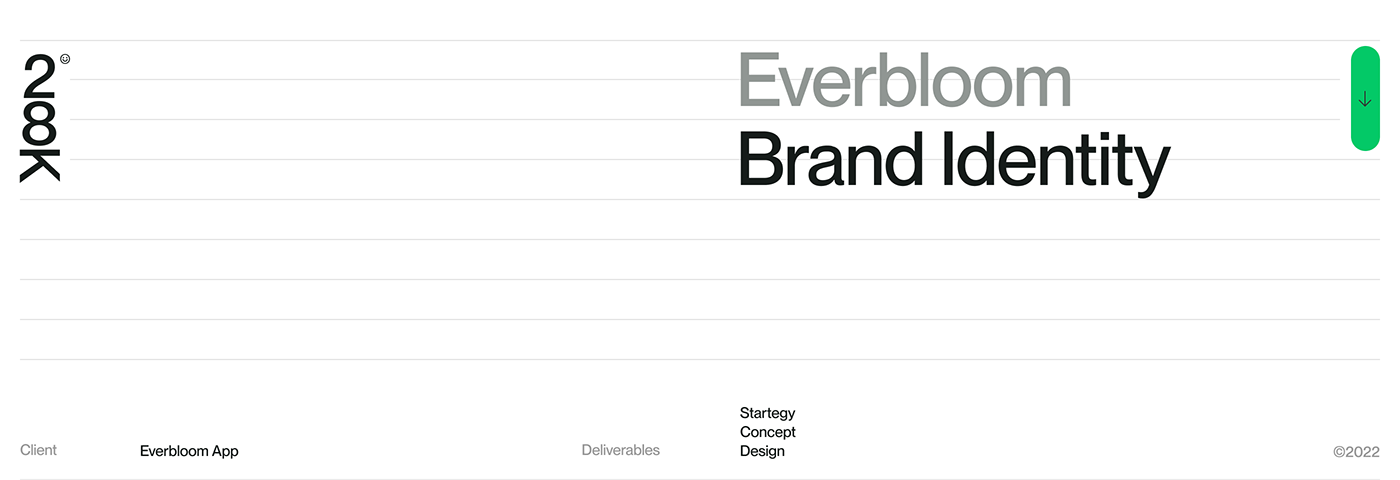
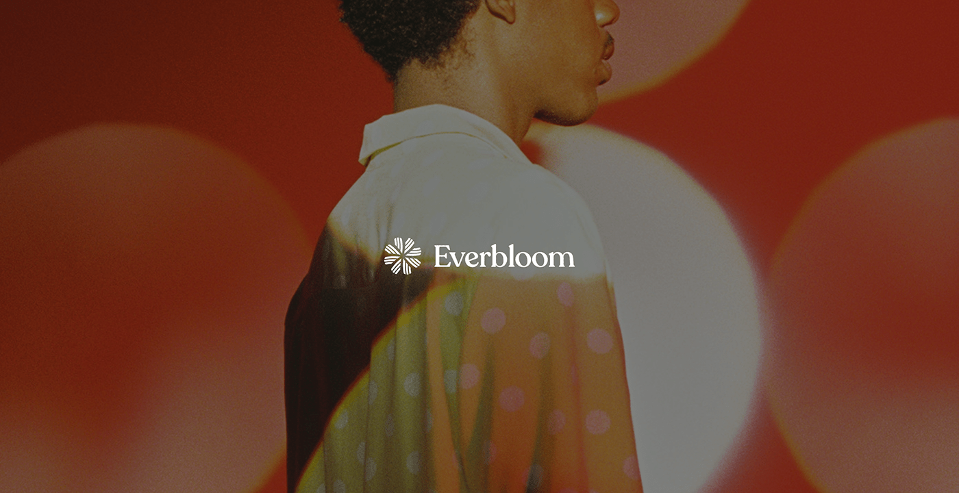
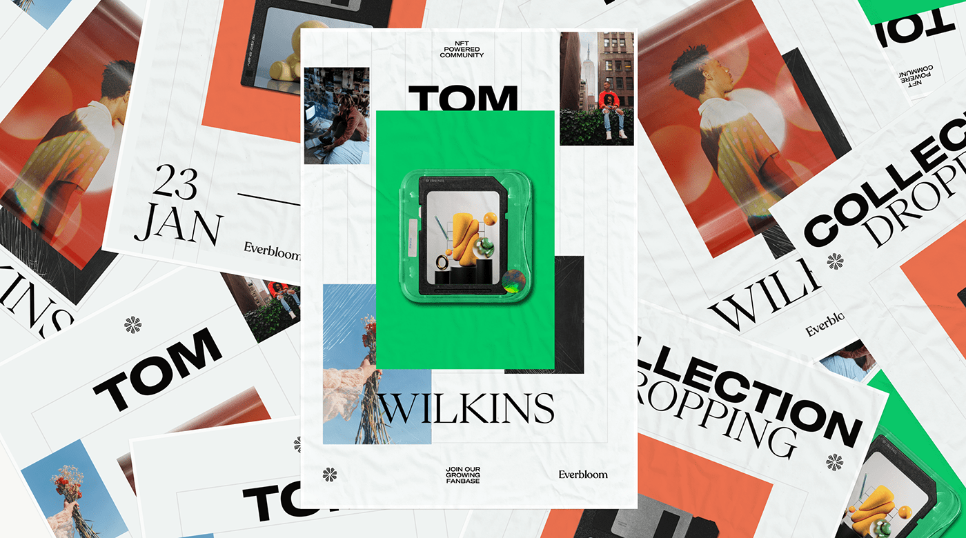
In the world of design, the successful fusion of intentionality and creativity can produce extraordinary results. Studio 28K and Everbloom exemplify this powerful collaboration, as they skillfully marry passion and self-expression with tangible opportunities. Everbloom’s refined branding and visual identity, sculpted by Studio 28K, captures the brand’s essence of perpetuity, adaptability, and persistence. The EverGrid, an open-ended creative framework, serves as the foundation of this dynamic visual identity. With bold typography and a meticulously crafted grid system, Everbloom’s branding strikes a perfect balance between audacity and consistency. The vibrant green and orange hues, paired with classic black and white, create a visual symphony that reflects growth, renewal, energy, fervor, and zest. Studio 28K’s strategy shines through in their thoughtfully curated imagery, which adds a contemporary and relatable touch to Everbloom’s identity. All in all, Everbloom’s visual identity showcases the power of intentional choices and creative freedom, resonating deeply with the brand’s ethos.
This image is property of lh4.googleusercontent.com.
Branding and Visual Identity Artifacts
Branding and visual identity artifacts play a crucial role in communicating a company’s values, personality, and overall image. They provide a visual representation of the brand, allowing customers to identify and connect with it on a deeper level. Everbloom, in collaboration with Studio 28K, has curated a refined collection of branding and visual identity artifacts that truly capture the essence of the brand.
Introduction
In the vast expanse of the design realm, the marriage of intentionality and creativity births masterpieces. One such collaboration emerged between Studio 28K and Everbloom—a brand ardently journeying towards converting passion and self-expression into tangible opportunity. This partnership has resulted in a refined branding and visual identity that sets Everbloom apart from its competitors.
This image is property of lh4.googleusercontent.com.
The EverGrid: A Playground for Creativity
Everbloom, in its very essence, is reminiscent of perpetuity—evolving, adapting, and persisting. This dynamic nature of the brand called for an identity that was both malleable yet strong. The answer? The EverGrid. Conceived as an open-ended, creative framework, the EverGrid is not merely a structure; it’s a playground for boundless creativity. It provides Everbloom with the flexibility to explore various design elements while maintaining a consistent and cohesive brand identity.
Bold Typography with Meticulous Composition
The visual identity of Everbloom is built upon bold typography and meticulous composition. At first glance, the typography stands out as a testament to the brand’s audacity. It demands attention and conveys a sense of confidence. However, upon closer examination, one can appreciate the level of detail and precision that went into its composition. Studio 28K has seamlessly combined boldness with structure, allowing the design to be both visually striking and harmoniously balanced.

This image is property of lh5.googleusercontent.com.
The Significance of Color Choices
Color choices in branding are never arbitrary. In Everbloom’s case, the vibrant shades of green and orange are not just choices; they’re statements. Green, often symbolic of growth, renewal, and energy, resonates with Everbloom’s mission of turning passions into opportunities. The orange, vibrant and attention-grabbing, reflects the brand’s fervor and zest. These vivacious colors, when juxtaposed with the timeless elegance of black and white, create a visual symphony—both fresh and contemporary.
The Breath of Fresh Air in Imagery
The imagery used in Everbloom’s branding is truly a breath of fresh air. It is contemporary, relevant, and striking, augmenting the brand’s identity and making it relatable and aspirational simultaneously. Studio 28K’s choice of imagery demonstrates their sheer brilliance and strategy. While rooted in design principles, they are not afraid to break the mold when necessary to create a visually captivating and unique visual narrative.
This image is property of lh4.googleusercontent.com.
Studio 28K’s Brilliant Strategy
Studio 28K’s strategy behind Everbloom’s branding and visual identity is nothing short of brilliant. Their approach combines design principles and creative liberty to craft a brand identity that is visually pleasing and deeply resonant with Everbloom’s ethos. The EverGrid framework, with its structured yet free nature, echoes the very spirit of Everbloom—evolving, vibrant, and dynamic.
The Brilliance of Design Thinking
Everbloom’s refined branding and visual identity is a testament to the brilliance of design thinking. The process of intentional choices, coupled with creative liberty, has resulted in an identity that captures the essence of the brand. Studio 28K has successfully crafted a narrative that is visually engaging, consistent, and deeply resonant with Everbloom’s mission.
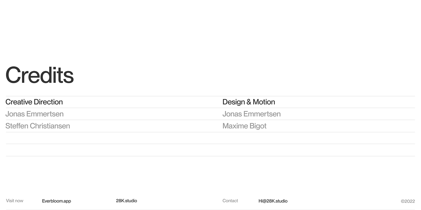
This image is property of lh5.googleusercontent.com.
The Narrative of Everbloom’s Brand Identity
Everbloom’s branding and visual identity, sculpted by Studio 28K, is a masterclass in design thinking. It tells a story of the brand’s evolution, highlighting the passion, creativity, and opportunity that Everbloom represents. Each artifact, from the typography to the imagery, contributes to this narrative, creating a cohesive and memorable brand identity.
Conclusion
In conclusion, Everbloom’s collaboration with Studio 28K has resulted in a refined branding and visual identity that truly captures the essence of the brand. The EverGrid framework, bold typography, carefully chosen colors, and striking imagery all contribute to a visual narrative that is both captivating and resonant. Everbloom stands out as a brand that embraces creativity, self-expression, and the possibilities of turning passion into tangible opportunities. With Studio 28K’s guidance, Everbloom has achieved a brand identity that is not only visually pleasing but also deeply meaningful.
Source: https://abduzeedo.com/everblooms-refined-branding-and-visual-identity-studio-28k