

Space Refinery: A Stellar Leap in Branding and Visual Identity
Step into the world of Space Refinery, an innovative design company based in Brussels that is revolutionizing workspaces. With a mission centered around creating environments that foster connection, concentration, and collaboration, Space Refinery is reshaping the way we view and experience work. In a recent project led by Sarah Done, the brand underwent a complete transformation, encompassing not only visual elements but also the brand’s tone of voice and personality. The custom typography pays homage to the NASA logo, evoking a sense of nostalgia while blending it seamlessly with a forward-looking approach. The elegant black and white color scheme is punctuated by a vibrant yellow accent, symbolizing the brand’s innovative and positive spirit. The brand values and personality align harmoniously, resulting in a thoughtfully crafted visual identity that captures the essence of Space Refinery.
Branding and Visual Identity Transformation

This image is property of lh3.googleusercontent.com.
Introduction to Space Refinery
In the bustling heart of Brussels, a unique company is setting new standards in the design realm. Space Refinery, not just a name, but an ethos, brings to the forefront the essence of design with purpose. With their mission centered around creating work environments that foster connection, concentration, and collaboration, they’re redesigning how we perceive workspaces.
Mission and Values
Space Refinery’s mission is to create work environments that promote connection, concentration, and collaboration. They aim to provide spaces that inspire productivity and creativity while fostering a sense of community and well-being among workers. Their core values include agility, pragmatism, drive, positivity, and sustainability. These values guide every aspect of their work, from the design process to their interactions with clients and partners.

This image is property of lh4.googleusercontent.com.
Brand Personality
The brand personality of Space Refinery reflects their ethos and values. The visual representation showcases them as innovative, collaborative, creative, reliable, and sustainable. This personality is reflected in every curve and shade of their visual identity, ensuring a cohesive and well-thought-out design strategy.
Custom Typography
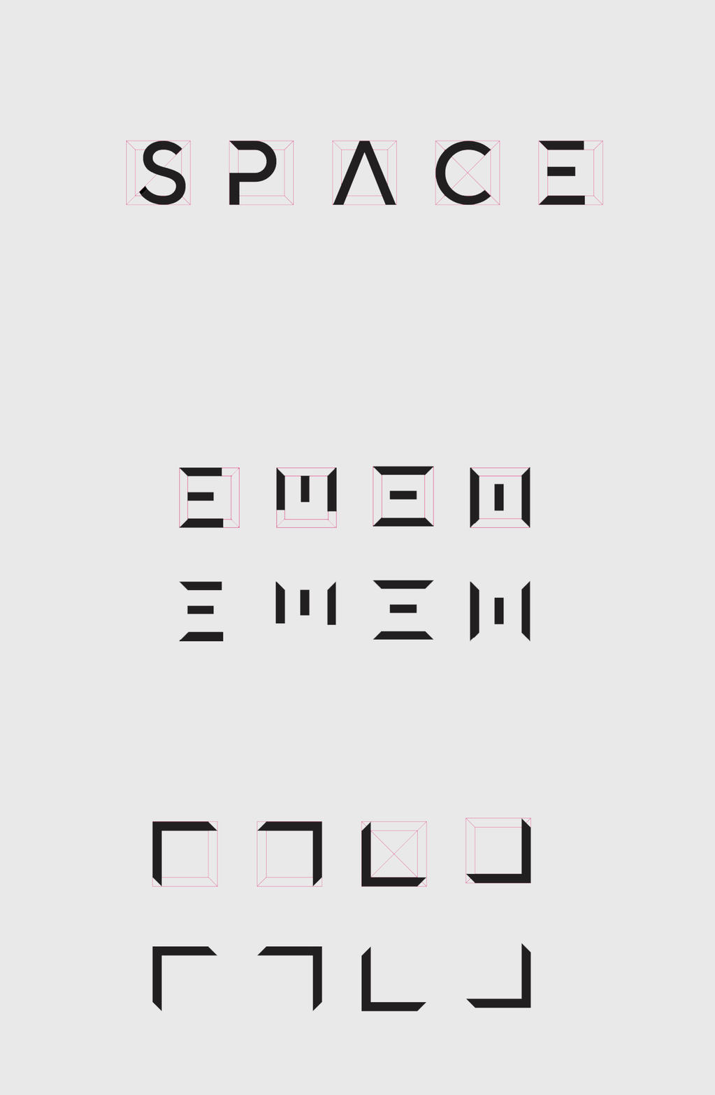
One of the standout features of Space Refinery’s branding transformation is the custom typography. The typography used evokes a sense of nostalgia, reminiscent of the old NASA logo. This choice captures a timeless charm, seamlessly blending the gravitas of the past with the aspirations of the future. The custom typography not only adds visual interest but also serves as a symbol of Space Refinery’s commitment to connection – connecting eras, designs, and people.
This image is property of lh5.googleusercontent.com.
Color Palette
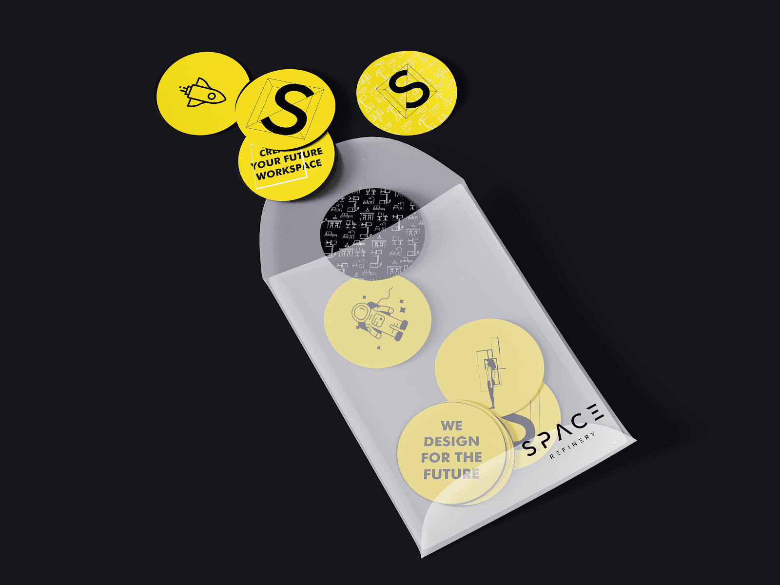
The color palette chosen for Space Refinery’s visual identity remains elegant and simplistic. Primarily black and white, it exudes professionalism and clarity. However, the masterstroke lies in the infusion of a yellow accent. This choice not only brings life and vibrancy to the design but also symbolizes the brand’s innovative and positive spirit. The yellow accent adds a touch of warmth and energy to the overall visual identity.
Visual Identity Artifacts
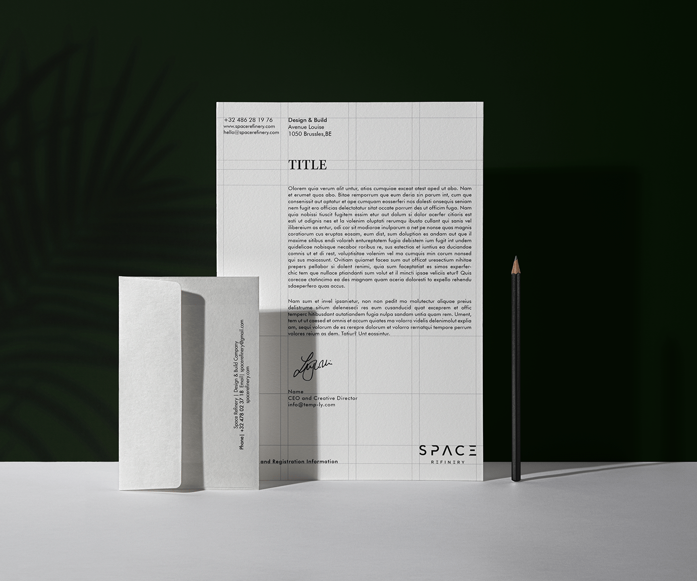
The visual identity of Space Refinery is expressed through various artifacts. These artifacts include a logo, business cards, stationery, packaging, and mockups. The logo serves as the centerpiece of the visual identity, embodying the brand’s values and personality. The business cards and stationery maintain a consistent and professional look, representing Space Refinery’s commitment to quality and reliability. The packaging and mockups showcase the visual identity in real-world applications, allowing clients and partners to envision the brand in different contexts.
This image is property of lh4.googleusercontent.com.
Space Refinery Branding Transformation
Overview of Branding Transformation
The branding transformation undertaken by Space Refinery encompasses not only a visual overhaul but also delves deep into the brand’s tone of voice and personality. The transformation aims to create a cohesive and compelling brand identity that aligns with the company’s mission and values.
Focus on Branding Elements
The branding transformation focuses on various elements, including custom typography, color palette, logo design, and visual identity artifacts. Each element plays a crucial role in shaping the overall brand identity and conveying the brand’s essence and values.
Significance of Visual Identity
The visual identity of a brand is vital as it serves as the first point of contact for potential clients and partners. A well-designed visual identity conveys professionalism, reliability, and creativity, setting the tone for the brand’s interactions and relationships. Space Refinery’s visual identity is carefully crafted to reflect their mission, values, and brand personality, ensuring a strong and memorable impression.
Role of Sarah Done in the Transformation
Sarah Done, a talented designer, played a significant role in the branding transformation of Space Refinery. Her expertise and creative vision helped shape the brand’s visual identity and bring it to life. Through her thoughtful design choices and attention to detail, Sarah captured the essence of Space Refinery and translated it into a visual language that resonates with the target audience.
Overview of Branding Transformation
The branding transformation undertaken by Space Refinery is a comprehensive process that goes beyond mere visual changes. It encompasses a deep understanding of the company’s mission and values, as well as an exploration of its brand personality. Through the use of custom typography, a carefully selected color palette, and visually impactful artifacts, Space Refinery has successfully transformed its branding to reflect its essence and position in the design industry.
This image is property of lh5.googleusercontent.com.
References
- Image Source: Space Refinery: A Stellar Leap in Branding and Visual Identity
- Design by: Sarah Done
- Sarah Done’s Behance Profile: Behance
- Space Refinery Website: spacerefinery.com
Source: https://abduzeedo.com/space-refinery-stellar-leap-branding-and-visual-identity