
Bloom Robbins: Crafting a Narrative Through Branding
In the world of design, crafting a narrative and evoking emotions are essential elements. Lukas Majzlan’s recent branding and visual identity work for Bloom Robbins exemplifies this notion. By centering the brand’s essence around three keywords – Unbridled, Playful, and Feminine – Majzlan constructs a compelling narrative that not only speaks to the audience but also resonates with them on a personal level. Bloom Robbins is more than just a brand; it represents the multifaceted nature of every woman, reflecting their playfulness, fierceness, and femininity. Through thoughtful choices in logo design, typography, and color, Majzlan has transformed branding into an art that not only aesthetically pleases but also connects, inspires, and reflects the journey of the brand.
This image is property of lh3.googleusercontent.com.
Logo Design
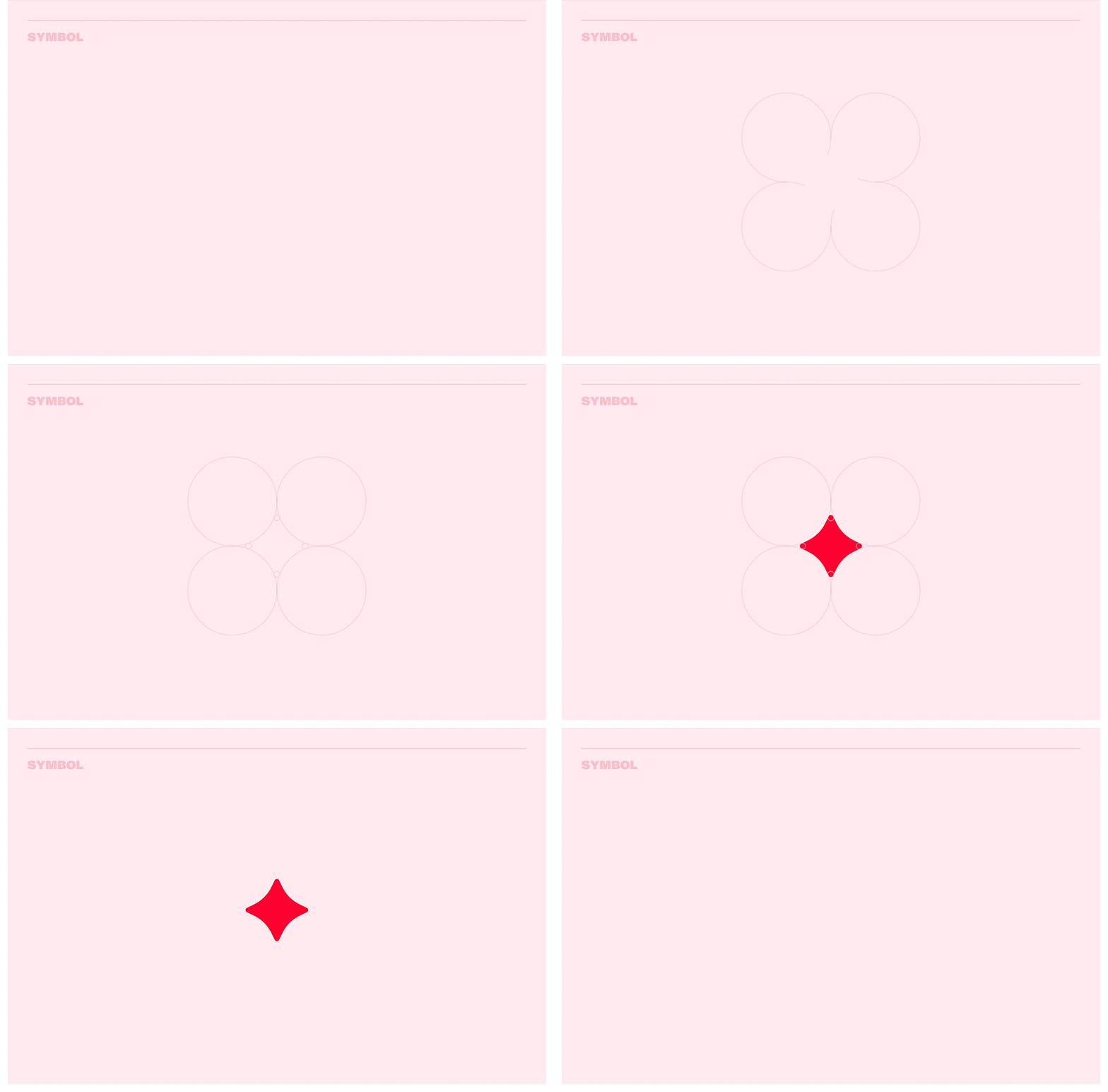
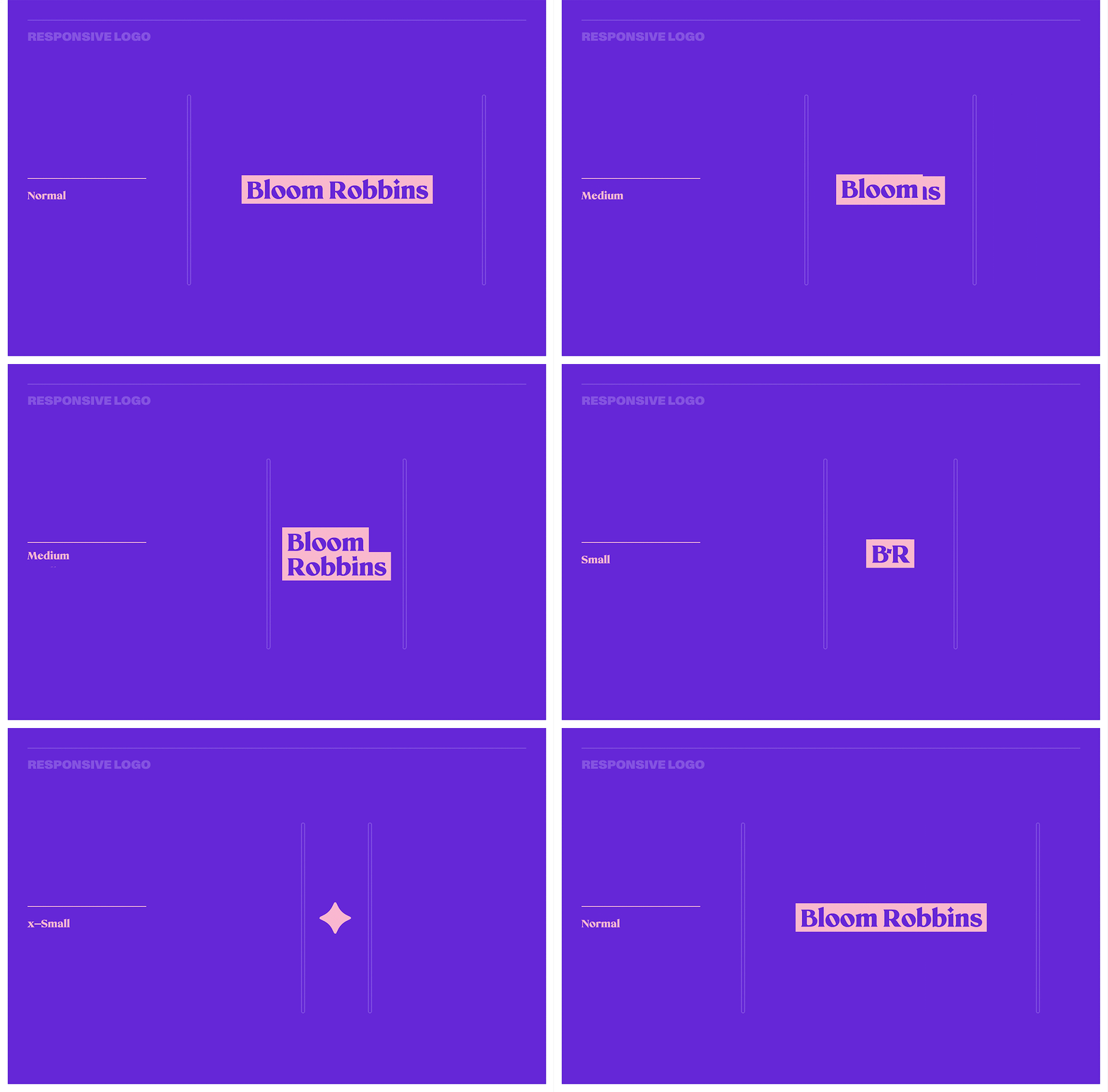
When it comes to crafting a strong brand identity, choosing the right name is crucial. For Bloom Robbins, the name itself evokes a sense of modern-day heroism and femininity. In designing the logo for Bloom Robbins, Lukas Majzlan sought to create a typographic logo that would convey the brand’s personality through the letterforms. After sifting through numerous concepts and fonts, Majzlan ultimately selected a font that strikes a balance between playfulness and elegance. The logo also offers two variations, with the primary variation featuring a colored background mask to ensure optimal contrast across different backgrounds.
Typography Choices
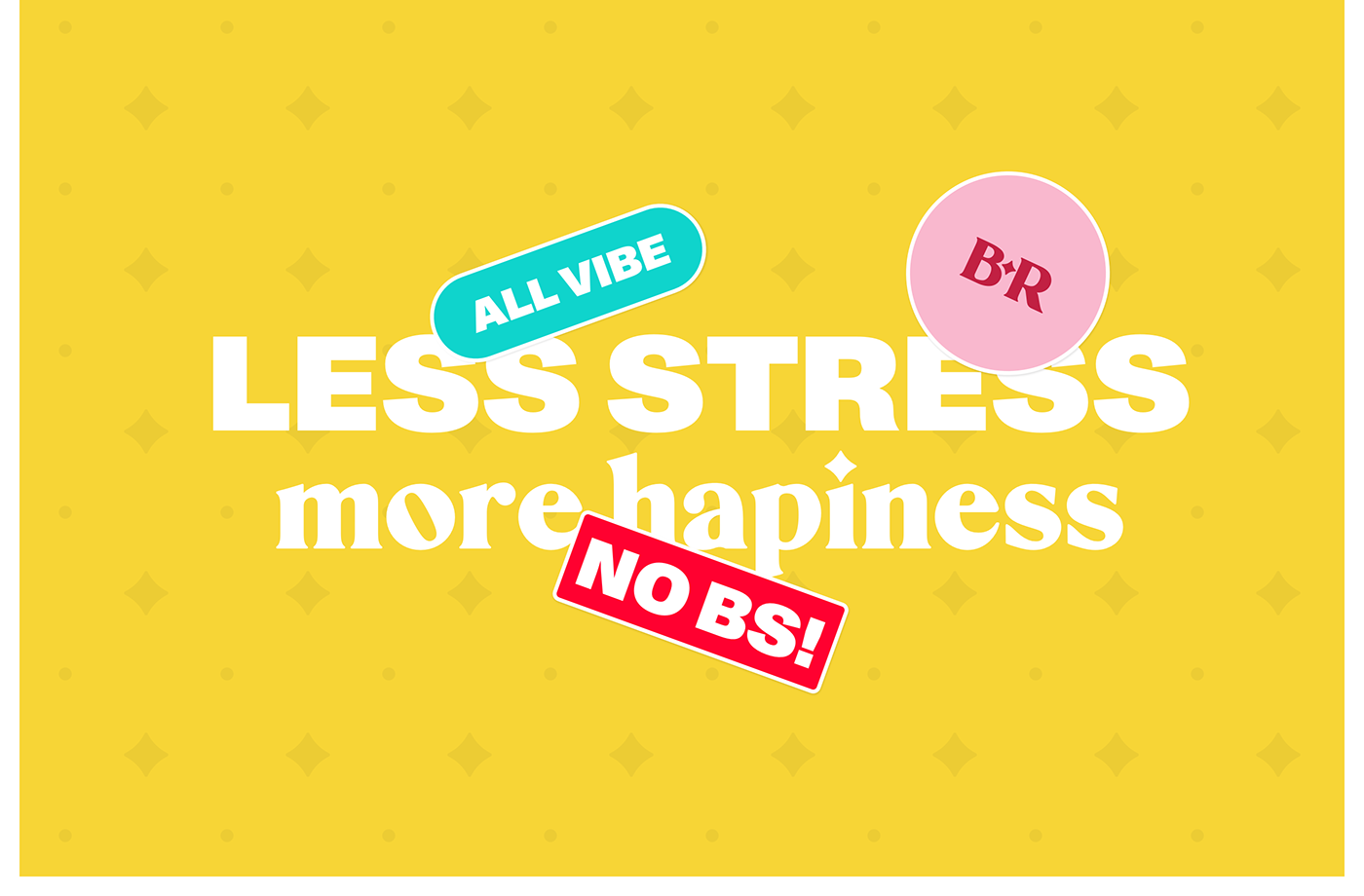
Typography plays a vital role in branding and visual identity. In the case of Bloom Robbins, the choice of typefaces helps to tell the brand’s story and convey its personality to the audience. Two distinct typefaces were selected to reflect the brand’s duality and pillars. The first typeface, Mikela, is a soft serif font that brings forth the brand’s playful and feminine undertones. It feels like a whisper, a lullaby, a secret shared among friends. The second typeface, Monument Grotesk, offers a bold and edgy contrast to Mikela. This font represents the unbridled spirit and fierceness in every woman. Together, these typefaces not only embody the essence of Bloom Robbins but also complement each other, especially when paired with specific color combinations.
This image is property of lh3.googleusercontent.com.
Crafting a Narrative
Storytelling is a powerful tool in branding, and it is especially critical for Bloom Robbins. The brand’s essence is rooted in three keywords: Unbridled, Playful, and Feminine. Lukas Majzlan masterfully crafts a narrative that goes beyond mere product representation and connects with the audience on a personal level. Bloom Robbins is more than just a brand; it is an embodiment of the multifaceted nature of every woman. It represents a journey, a feeling, and a statement. By reflecting the essence of Bloom Robbins in the branding, Majzlan creates a narrative that resonates with the target audience and establishes a deep and emotional connection.
Color Choices
Color psychology plays a significant role in branding, as different colors evoke different emotions and associations. In the case of Bloom Robbins, the color choices were carefully considered to enhance the brand’s messaging and connect with the audience. The psychology of color was taken into account to ensure that each color in the brand’s palette conveys the desired emotions and resonates with the target market. Additionally, the exploration of color combinations helped create a harmonious visual identity that captures the essence of Bloom Robbins.
This image is property of lh5.googleusercontent.com.
Design Principles
Creating a cohesive visual identity involves adhering to certain design principles. Balance and proportion are important elements in ensuring a visually appealing and harmonious brand identity. By carefully considering the placement and size of various design elements, the visual identity of Bloom Robbins achieves a balanced and proportionate composition. Hierarchy and contrast are also essential design principles that help guide the viewer’s attention and create visual interest. By effectively utilizing hierarchy and contrast in the branding, the essence of Bloom Robbins is effectively communicated and the brand stands out in a crowded market.
Branding as Art
Branding is not just about aesthetics; it can also be elevated to the level of art. Lukas Majzlan’s work for Bloom Robbins exemplifies this by showcasing creativity and pushing the boundaries of what branding can achieve. The careful consideration of typography, color choices, and design principles transforms the branding into more than just a brand design. It becomes a story, an emotion, and a movement. Majzlan’s work demonstrates that branding can go beyond mere visual representation and can inspire, connect, and resonate with the audience.
This image is property of lh6.googleusercontent.com.
Uniqueness and Differentiation
In today’s crowded market, standing out from the competition is crucial for a brand’s success. Bloom Robbins understands the importance of creating a distinctive brand identity that sets it apart from others. By crafting a narrative and embracing creativity in brand design, Bloom Robbins ensures that its brand identity is unique and memorable. The brand’s commitment to being unbridled and playful while maintaining a sense of femininity allows it to differentiate itself from other brands in the market.
Emotion and Connection
Creating an emotional connection with the target audience is key to building a successful brand. By eliciting emotions through branding, Bloom Robbins taps into the desires, aspirations, and experiences of its target audience. The carefully crafted narrative and thoughtful design choices ensure that the brand resonates with the audience on a personal level. Building this emotional connection fosters loyalty and helps the brand connect with customers on a deeper level.
This image is property of lh5.googleusercontent.com.
Branding Across Platforms
In today’s digital age, it is important for brands to adapt their visual identity to different platforms and mediums. Bloom Robbins understands the need for consistency and coherence across various platforms to maintain brand recognition and reinforce its messaging. Adapting the visual identity to different platforms involves making necessary adjustments while preserving the core elements that define the brand. By maintaining a consistent visual identity, Bloom Robbins ensures that its brand remains recognizable and cohesive across all touchpoints.
Conclusion
Crafting a narrative through branding is essential for creating a strong and impactful brand. Bloom Robbins exemplifies this by embodying its essence in every aspect of its visual identity. From the carefully chosen name to the typography, colors, and design principles, the brand tells a powerful story that resonates with its target audience. By utilizing creativity, uniqueness, and emotional connection, Bloom Robbins stands out in a crowded market and creates a brand identity that is truly memorable and evocative.
Source: https://abduzeedo.com/bloom-robbins-crafting-narrative-through-branding