

FëstiaMusic’s Branding: A Testament to Minimalistic Brilliance in Visual Identity
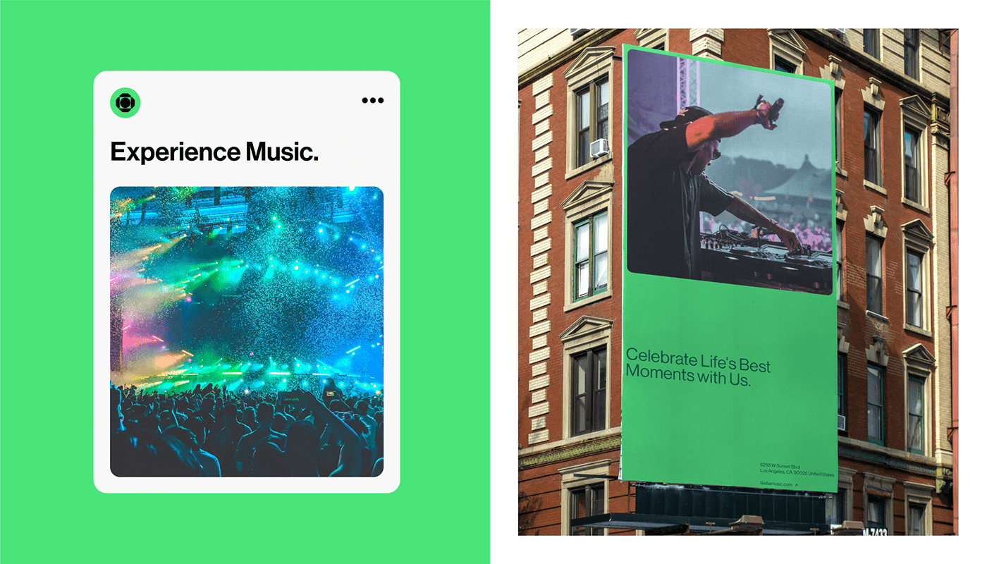
FëstiaMusic’s branding is an exquisite embodiment of minimalistic brilliance in visual identity. Led by Creative Director Alee Hyder and the talented Graphic Designers Ahsan Khan and Rashed Khan, this brand identity resonates with its audience through its impeccable design aesthetics. The typography, inspired by classic sans-serif fonts, is presented in uppercase, exuding confidence and clarity. The carefully chosen colors add depth and emotion to the designs, while the strategic placement of text on a canvas of generous white space draws the viewer’s attention. In a world where cluttered design is common, FëstiaMusic’s branding stands as a testament to the power of simplicity and well-thought-out design choices. It is an experience curated by visionaries and invites the audience to become a part of the FëstiaMusic journey.
This image is property of lh4.googleusercontent.com.
Typography as the Cornerstone
When it comes to branding, typography plays a crucial role in capturing the essence of a brand’s identity. FëstiaMusic understands the power of typography and has made it the cornerstone of their visual representation. Led by Creative Director Alee Hyder, with the impeccable skills of Graphic Designers Ahsan Khan and Rashed Khan, the branding of FëstiaMusic emerges as a beacon for minimalistic UI/UX and web design.
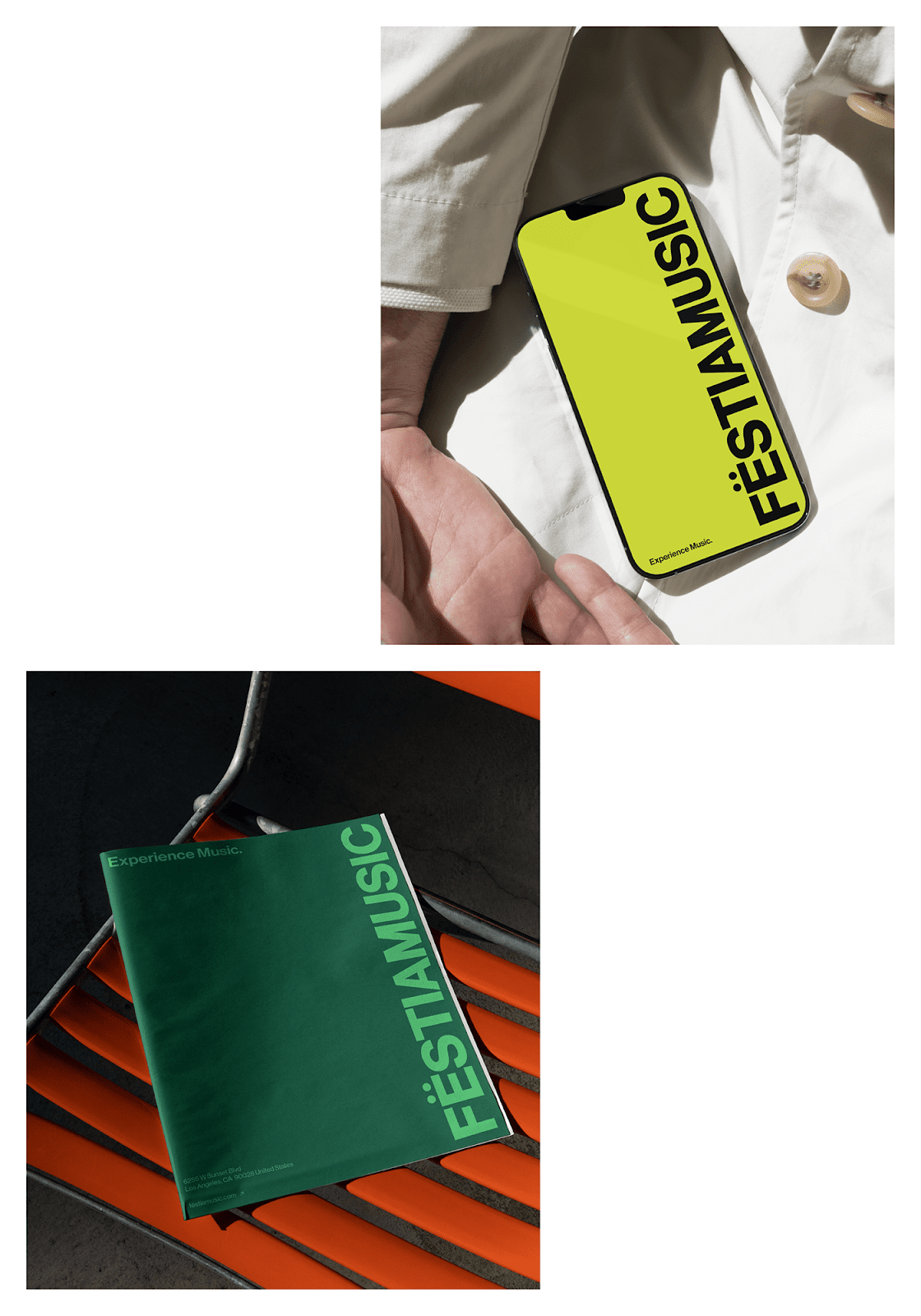
The choice of typography for FëstiaMusic is a testament to the brand’s clear vision. Taking inspiration from classic sans-serif fonts like Helvetica, the text is presented in uppercase. This might seem like a simple choice, but it carries profound significance in the world of branding. Uppercase typography exudes confidence and clarity, standing tall and unyielding, mirroring the brand’s vision. It grabs the viewer’s attention and leaves a lasting impression.
The Significance of Uppercase Typography
Uppercase typography is often associated with authority and professionalism. By using uppercase letters, FëstiaMusic establishes itself as a brand that is confident, reliable, and knows what it stands for. The clean and bold lines of uppercase letters also add a sense of sophistication and elegance to the brand’s visual identity. Overall, uppercase typography is a powerful tool that helps FëstiaMusic create a strong and memorable brand presence.
This image is property of lh5.googleusercontent.com.
The Impact of Color
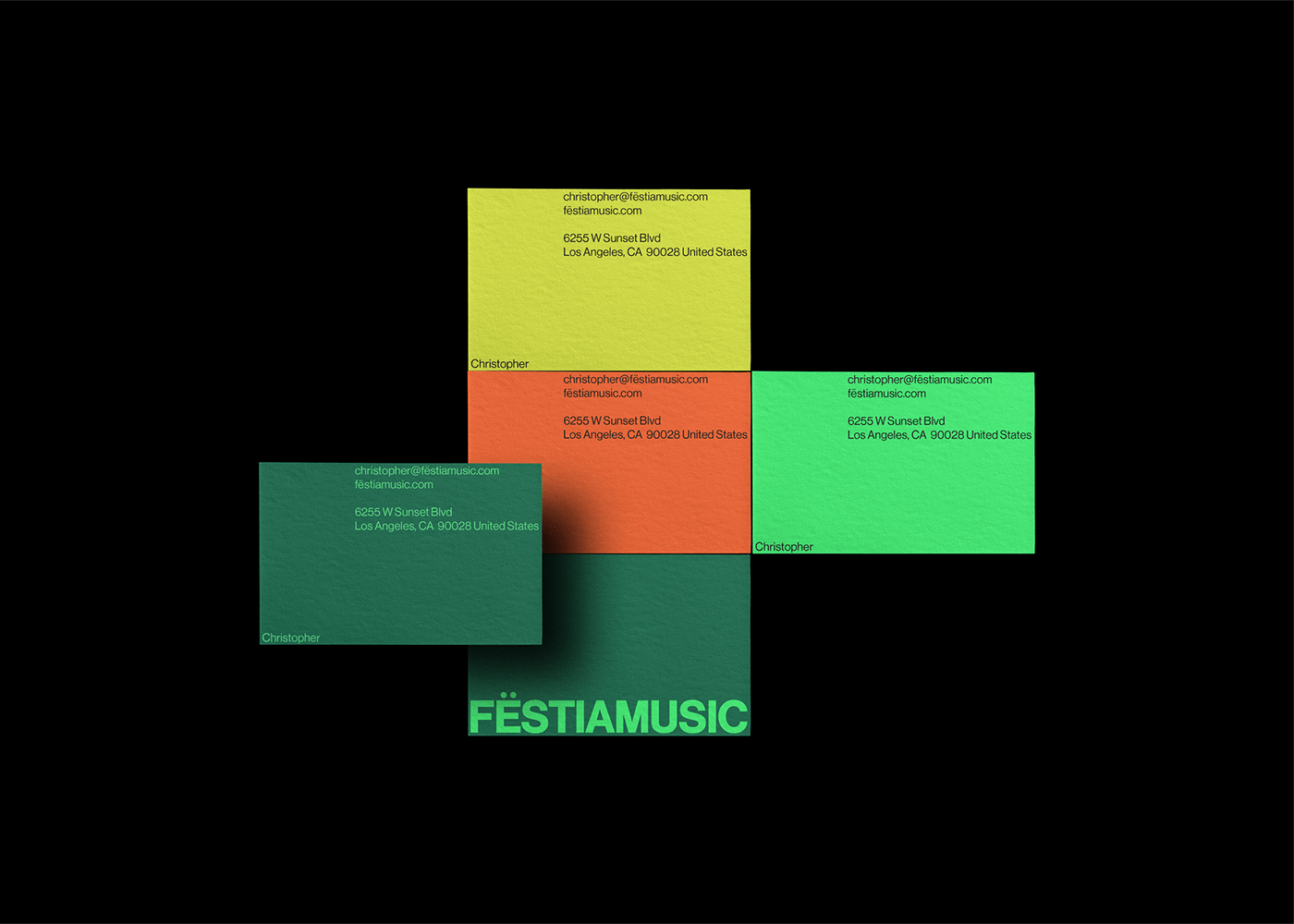
In addition to typography, the choice of color is equally important in creating a cohesive and impactful branding. FëstiaMusic understands this and has carefully selected vibrant combinations of green, yellow, and orange to represent its brand. These colors are not just random choices; they are carefully selected to reflect the brand’s personality and values.
Green, with its association with nature and growth, represents FëstiaMusic’s desire to create music that is fresh, organic, and ever-evolving. Yellow, with its bright and energetic nature, represents the brand’s optimism and creativity. Orange, with its warmth and enthusiasm, represents the brand’s passion and dedication to creating memorable musical experiences.
By using these vibrant colors, FëstiaMusic’s branding comes alive and creates a visual language that resonates with its target audience. The combination of these colors adds layers of depth and emotion to the brand’s designs, making them memorable and impactful.
Vibrant Combinations of Green, Yellow, and Orange
FëstiaMusic’s branding materials showcase the vibrant combinations of green, yellow, and orange in a visually stunning way. From business cards and posters to letterheads and the website, every element of the brand’s visual identity is meticulously designed to create a cohesive and captivating experience.
The designs explore the use of solid colors, strategically positioning the text on the canvas’s edge. This design choice might appear simple, but it serves a higher purpose. The generous white space around the text isn’t just empty space; it’s a canvas that draws the viewer’s attention, making the text the focal point. It creates a sense of balance and harmony while allowing the vibrant colors to take center stage.

This image is property of lh3.googleusercontent.com.
Color as Emotions, Aspirations, and the Heartbeat
Color is a powerful tool that can evoke emotions, aspirations, and even a sense of rhythm. FëstiaMusic understands this and has used color as a way to connect with its audience on a deeper level. The vibrant greens, yellows, and oranges used in the branding represent not just the brand’s personality but also the emotions and aspirations it aims to evoke in its audience.
Green symbolizes growth, renewal, and harmony. It represents FëstiaMusic’s mission to create music that brings people together and creates a sense of unity.
Yellow represents positivity, energy, and creativity. It embodies FëstiaMusic’s commitment to bringing joy and inspiration to its audience through its music.
Orange represents passion, excitement, and enthusiasm. It symbolizes the brand’s dedication to creating music that is filled with emotion and leaves a lasting impact.
By using these vibrant colors, FëstiaMusic’s branding creates a visual language that speaks to the heart and soul of its audience.
The Art of Minimalism
FëstiaMusic’s branding is a testament to the power of minimalism in design. In a world where cluttered and busy designs often dominate the digital landscape, FëstiaMusic’s minimalistic approach stands out as a breath of fresh air.
Minimalism is all about simplifying complex ideas and distilling them down to their bare essentials. It’s about removing anything that is unnecessary and focusing on what truly matters. FëstiaMusic understands this concept and has applied it to its branding efforts.
The use of clean lines, generous white space, and minimalistic typography creates a sense of elegance and sophistication. It allows the brand’s message to shine through without any distractions. The simplicity of the design allows the audience to focus on the music and the emotions it evokes, rather than being overwhelmed by excessive visual elements.
This image is property of lh4.googleusercontent.com.
Simplicity in UI/UX and Web Design
FëstiaMusic’s branding extends beyond its visual identity and permeates its UI/UX and web design. The same principles of minimalism and simplicity are applied to create a seamless and intuitive user experience.
The user interface is clean and uncluttered, with a focus on functionality and ease of use. The navigation is intuitive, making it easy for users to find what they are looking for. The use of whitespace allows the content to breathe and gives the user’s eyes a place to rest.
The website’s design also reflects the vibrant colors and typography used in the branding. This creates a cohesive and immersive experience for the audience, strengthening the connection between the brand and its users.
The Dance of Elements
Good design is all about finding the delicate balance between various elements. FëstiaMusic’s branding exemplifies this balance, creating a seamless dance of elements that captures the essence of the brand.
From typography and color to layout and whitespace, every element is carefully considered and strategically placed. The text is positioned strategically on the canvas’s edge, allowing the vibrant colors to take center stage. The generous whitespace creates a sense of balance and allows the elements to breathe. The result is a visually stunning design that grabs attention and leaves a lasting impression.

This image is property of lh4.googleusercontent.com.
Strategic Text Placement
FëstiaMusic’s branding showcases the power of strategic text placement. By positioning the text strategically on the canvas’s edge, the brand creates a visual hierarchy that draws the viewer’s attention.
The text is not just placed randomly; it is positioned in a way that creates balance and harmony with the rest of the design elements. The whitespace around the text allows it to stand out and become the focal point of the design. This strategic text placement adds depth and dimension to the brand’s visual identity, making it visually engaging and memorable.
Conclusion
FëstiaMusic’s branding is more than just design; it’s an experience. Led by visionaries like Alee Hyder, Ahsan Khan, and Rashed Khan, the brand has created a visual identity that is minimalistic, impactful, and memorable. From the choice of typography and colors to the strategic placement of elements, every aspect of the branding has been carefully considered and executed with precision.
FëstiaMusic’s branding serves as a testament to the power of simplicity and the impact of well-thought-out design choices. It reminds us that sometimes, less is more, and that by focusing on what truly matters, we can create experiences that resonate with our audience on a deeper level.
With its minimalistic brilliance in visual identity, FëstiaMusic stands as a beacon for UI/UX and web design, showing us the power of typography, color, and strategic placement. It invites us to delve deeper into its world and become a part of its musical journey.
Source: https://abduzeedo.com/festiamusics-branding-testament-minimalistic-brilliance-visual-identity