
Fusion of Organic & Modern in Branding and Visual Identity
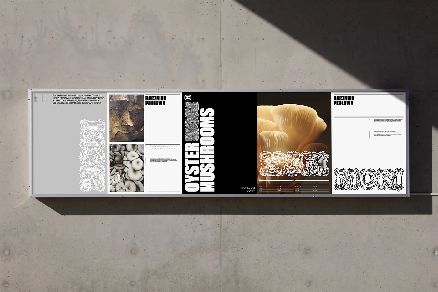
Dive into MORI’s branding and visual identity, where the fusion of organic forms and modern Swiss-style compositions creates a captivating design story. Jarosław Dziubek’s design for MORI showcases the seamless combination of two seemingly disparate elements to produce a visually stunning narrative. The bold typography immediately grabs attention, while the intricate logo intertwines organic trails with the word “MORI” itself, symbolizing the brand’s essence. The use of Swiss design principles throughout, coupled with the logo’s organic forms, exemplifies the dual nature of MORI’s business. From the meticulously crafted grid compositions to the elegant packaging design, each element contributes to a harmonious and structured visual experience. Overall, MORI’s branding and visual identity, an exceptional creation by Jarosław Dziubek, highlights the power of design in shaping and conveying a brand’s story.
This image is property of lh7-us.googleusercontent.com.
Typography and Logo Design
Bold block style typography
At the forefront of MORI’s branding and visual identity is the bold block style typography. This choice of typography immediately commands attention and creates a high-impact visual presence. The use of bold, chunky letterforms gives the typography a strong and powerful aesthetic. It captures the essence of MORI’s brand and conveys a sense of confidence and authority.
Intricate MORI logotype
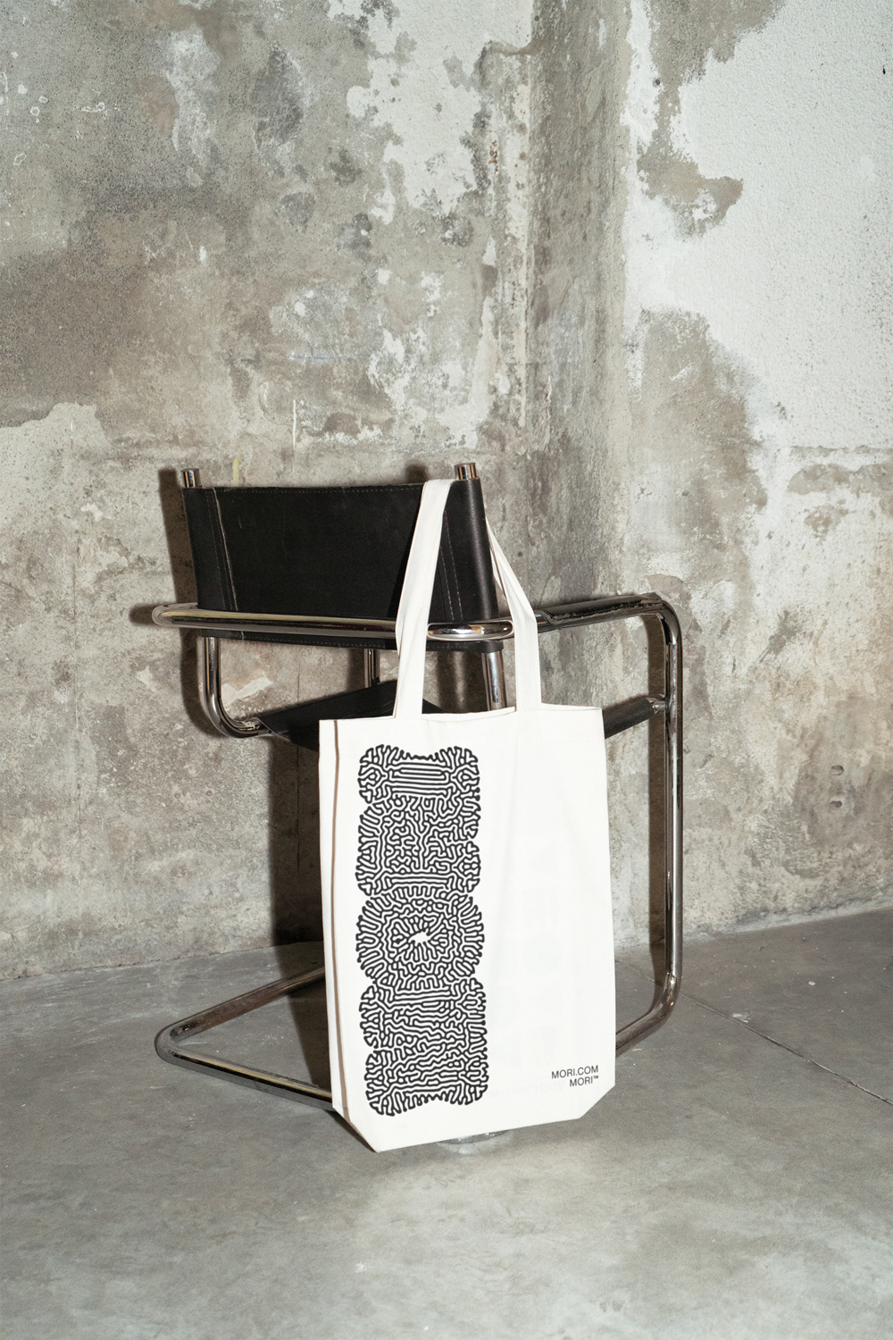
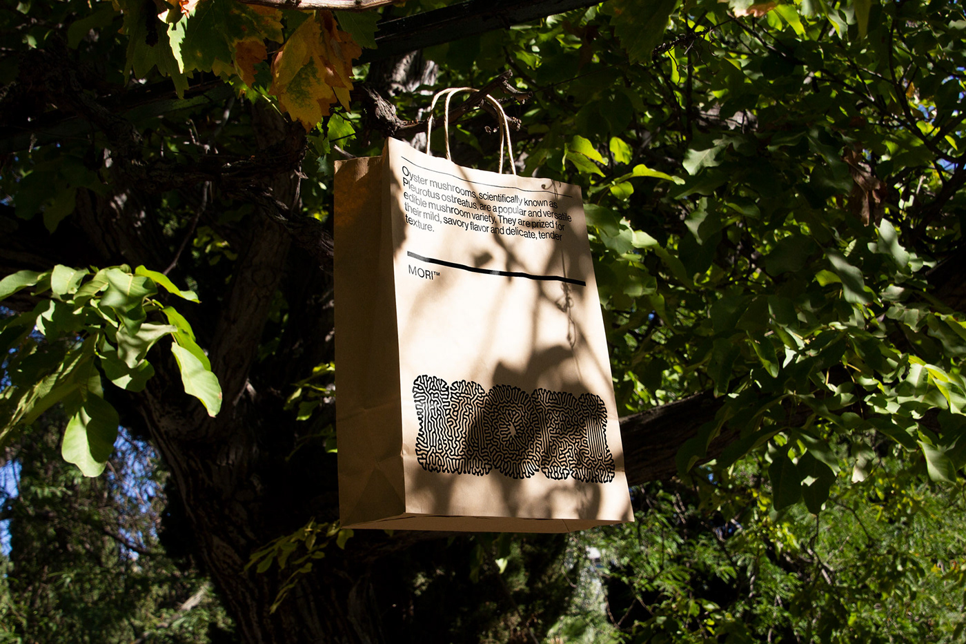
One of the standout elements of MORI’s visual identity is the intricate logotype. At first glance, it appears to be a complex and organic design, reminiscent of the patterns found in nature. The logotype incorporates the word “MORI” within its structure, cleverly weaving the brand’s name into its visual identity. This design choice not only adds visual interest but also highlights the brand’s connection to the natural world.
Alignment with brand essence
The typography and logo design of MORI’s branding and visual identity are carefully aligned with the essence of the brand. The bold block style typography captures the brand’s strength and confidence, while the intricate logotype captures its connection to nature. This alignment ensures that every aspect of the visual identity reflects the brand’s core values and communicates its unique identity to the audience.
Swiss Design Principles
Meticulous grid compositions
MORI’s branding and visual identity demonstrate the influence of Swiss design principles, particularly through its meticulous grid compositions. The use of a grid not only adds structure and organization to the visual elements but also creates a sense of harmony and balance. Each element is carefully placed, ensuring that the overall design is visually pleasing and easy to navigate.
Typography influenced by Swiss design
Another element influenced by Swiss design principles is the typography. The typography used in MORI’s visual identity is simple, clean, and highly legible, all characteristics commonly associated with Swiss design. The focus on readability and clarity ensures that the typography effectively communicates the brand’s message and enhances the overall visual experience.
Harmonious and structured visual experience
Overall, MORI’s branding and visual identity offer viewers a harmonious and structured visual experience. The meticulous grid compositions and typography influenced by Swiss design principles work together to create a cohesive and unified visual identity. This attention to detail and commitment to creating a balanced and structured design contribute to the overall effectiveness of the brand’s visual communication.
This image is property of lh7-us.googleusercontent.com.
Narrative and Storytelling
Logo design as a storytelling tool
MORI’s logo design not only serves as a visual representation of the brand but also acts as a storytelling tool. The intricate and organic design of the logo expands and unfolds, much like a mushroom, subtly hinting at MORI’s line of business. This clever use of design elements creates a visual narrative that engages the audience and invites them to explore and discover more about the brand.
Representation of MORI’s line of business
The logo design of MORI effectively represents the brand’s line of business. Through its organic and intricate design, it subtly communicates the brand’s connection to natural elements, specifically oysters and mushrooms. This representation not only helps to differentiate MORI from its competitors but also adds depth and meaning to the brand’s visual identity.
Alignment of visual elements with brand identity
One of the key strengths of MORI’s branding and visual identity is its alignment of visual elements with the brand’s identity. Every aspect of the design, including the logo and other visual elements, works together to tell the brand’s story and communicate its values. This alignment ensures that the visual identity accurately represents the essence of the brand and creates a strong and memorable impression on the audience.
Supplementary Materials
Elegance of printed items
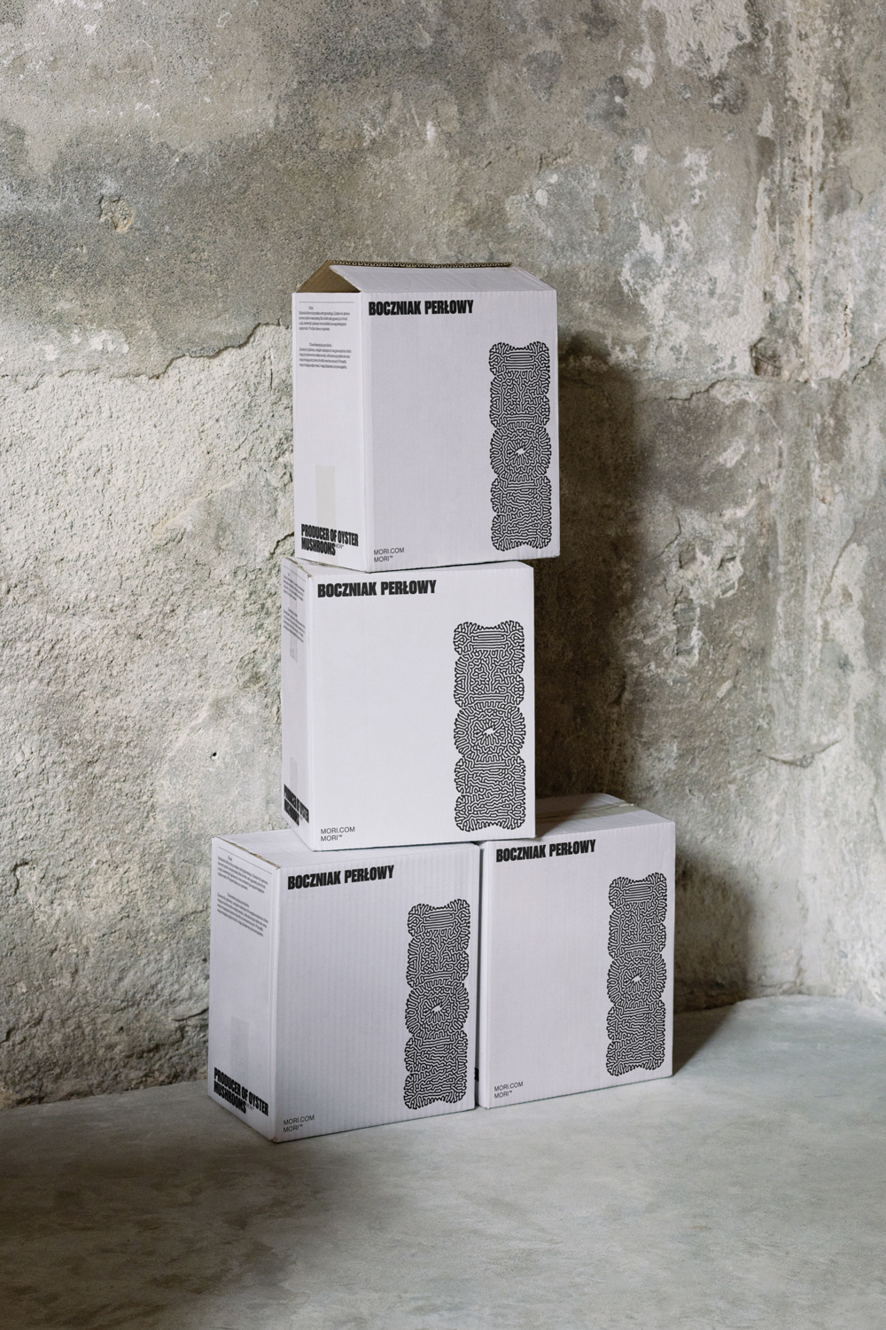
The supplementary materials of MORI’s branding and visual identity exude elegance, particularly through their use of printed items. The refined black and white palette creates a sophisticated and timeless aesthetic, adding a touch of luxury to the brand’s visual communication. The choice of high-quality print materials further enhances the overall elegance and creates a tactile and memorable experience for the audience.
Refined black and white palette
The refined black and white palette used in MORI’s supplementary materials adds to the brand’s visual identity. The simplicity and contrast of black and white create a clean and sophisticated look that reinforces the brand’s commitment to minimalism and quality. This palette also allows the brand’s logo and other visual elements to stand out and be easily recognized.
Bold packaging design
The packaging design of MORI’s visual identity is bold and eye-catching. The packaging features the brand’s logotype prominently and in a vertical orientation, ensuring that it catches the attention of consumers. This bold design choice demonstrates the brand’s commitment to innovation and distinction, while also creating a strong visual presence on shelves and in the hands of customers.
This image is property of lh7-us.googleusercontent.com.
Blending Organic and Modern Design
Masterclass in combining organic elements with modern principles
MORI’s branding and visual identity serve as a masterclass in blending organic elements with modern design principles. The use of organic forms in the logo and other visual elements creates a connection to nature and adds a sense of authenticity to the brand. At the same time, the incorporation of modern design principles, such as meticulous grid compositions and clean typography, ensures that the visual identity is contemporary and relevant.
Demonstration of contemporary design ethos
MORI’s branding and visual identity demonstrate a contemporary design ethos. The fusion of organic and modern elements creates a unique and visually striking aesthetic that captures the attention of the audience. This contemporary approach not only sets MORI apart from its competitors but also positions the brand as forward-thinking and innovative.
Branding and Visual Identity Artifacts
MORI’s branding and visual identity feature a range of artifacts that collectively communicate the brand’s identity and values. These artifacts include the logo, typography, grid compositions, and packaging design. Each artifact plays a crucial role in shaping the brand’s visual identity and creating a coherent and impactful design system.
This image is property of lh7-us.googleusercontent.com.
Jarosław Dziubek’s Contribution
Review of Jarosław Dziubek’s role in crafting MORI’s branding and visual identity
Jarosław Dziubek’s role in crafting MORI’s branding and visual identity is commendable. His design expertise and creativity shine through in every aspect of the brand’s visual identity, from the bold typography to the intricate logo design. Dziubek’s meticulous attention to detail and his ability to blend organic and modern elements have resulted in a visually stunning and memorable visual identity for MORI.
Link to Jarosław Dziubek’s Behance profile and website
For more information about Jarosław Dziubek and his work on MORI’s branding and visual identity, you can visit his Behance profile at https://www.behance.net/Dziubek. Additionally, you can explore his website at https://redkroft.com/ to see more of his design projects and learn more about his design philosophy.
In conclusion, MORI’s branding and visual identity, crafted by Jarosław Dziubek, successfully blend organic and modern elements to create a captivating and visually striking design story. The bold typography, intricate logo design, meticulous grid compositions, and elegant supplementary materials all contribute to a cohesive and memorable visual identity. This fusion of organic and modern design principles not only sets MORI apart but also communicates the brand’s values and story to the audience effectively. Jarosław Dziubek’s role in crafting this visual identity showcases his exceptional design skills and ability to create innovative and impactful brand identities.
Source: https://abduzeedo.com/fusion-organic-modern-branding-and-visual-identity