

Palma Portals Properties: A Minimalist Approach to Branding and Visual Identity
Take a journey into the world of minimalist branding and visual identity with Palma Portals Properties. Based in Palma de Mallorca, this development company has mastered the art of combining quality and design in their new builds and refurbishments. Their visual identity, expertly crafted by Enrique Presa, captures the essence of simplicity and timelessness. From the emblem, which symbolizes construction and architectural design, to the neutral color palette that reinforces themes of simplicity, every aspect of the branding reflects the company’s commitment to excellence. Presa’s design is both memorable and versatile, showcasing the power of minimalism in visual communication. Discover how simplicity can lead to clarity in this captivating exploration of Palma Portals Properties’ minimalist approach to branding and visual identity.

This image is property of lh5.googleusercontent.com.
Overview
Introduction
In the world of branding and visual identity, minimalism is a powerful and effective approach. Palma Portals Properties, a development company situated in Palma de Mallorca, epitomizes this principle with its focus on new builds and refurbishments. By seamlessly blending quality and design, Palma Portals Properties creates stunning multi-family structures and luxury homes.
Branding and visual identity concepts
Enrique Presa, the mastermind behind Palma Portals Properties’ branding, has crafted a visual identity that is both captivating and understated. Through his artistic touch, Presa has successfully manifested an evocative and minimalistic visual identity for the company.
Palma Portals Properties: An Introduction
About Palma Portals Properties
Palma Portals Properties, located in the heart of Palma de Mallorca, is a development company renowned for its commitment to quality and design. With a strong focus on new builds and refurbishments, they create exceptional residential structures that seamlessly blend luxury and functionality.
Focus on new builds and refurbishments
Palma Portals Properties concentrates on constructing new buildings and revitalizing existing ones. By utilizing their expertise and attention to detail, they are able to breathe new life into old structures, transforming them into contemporary and elegant spaces.
This image is property of lh4.googleusercontent.com.
Enrique Presa’s Visual Identity
The genius behind the branding endeavor
Enrique Presa, the creative force behind Palma Portals Properties’ visual identity, is a true genius in the field of design. With his keen eye for detail and innovative thinking, Presa has successfully brought the brand’s vision to life through his captivating visual identity.
Manifesting an evocative and understated visual identity
Presa’s design for Palma Portals Properties is a masterclass in evocative and understated branding. Each element, from the emblem to the color palette, is carefully chosen to reflect the company’s commitment to quality, precision, and timeless design.
The Emblem: Pure Geometric Shapes
Symbolic representations of construction, growth, and timelessness
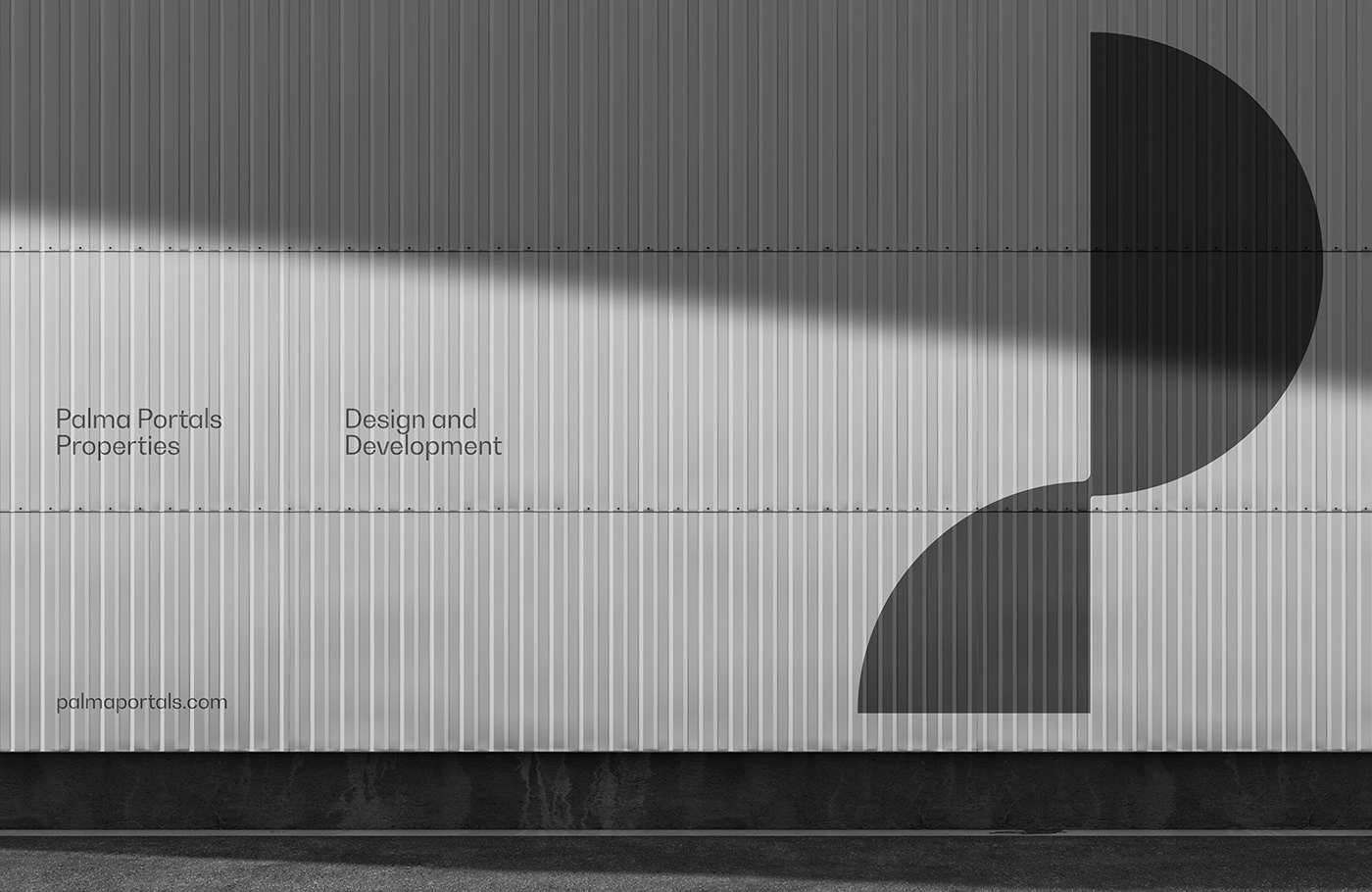
The emblem used by Palma Portals Properties is a symbolic representation of the core concepts of construction, growth, and timelessness. The use of pure geometric shapes conveys a sense of strength, stability, and architectural brilliance.
This image is property of lh6.googleusercontent.com.
The Color Palette: Neutral and Classic
Reinforcing simplicity and timelessness
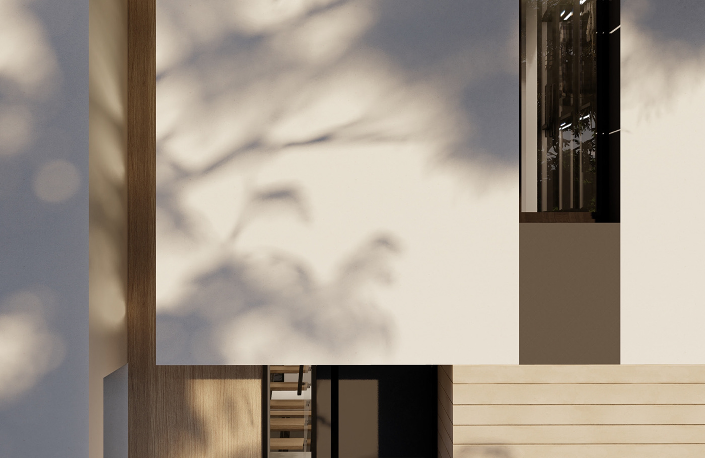
Palma Portals Properties’ color palette is deliberately neutral and classic. By staying away from bold and fleeting trends, the brand reinforces its commitment to simplicity, timelessness, and longevity. This approach ensures that the brand’s visual identity remains versatile and adaptable across various mediums.
Versatility in different mediums
The neutral and classic color palette chosen by Palma Portals Properties allows the brand’s visual identity to seamlessly translate across different mediums. Whether it is displayed on business cards, brochures, or large banners, the brand’s colors maintain their integrity and elegance, creating a consistent image of quality and precision.
Printed Materials: Showcasing Adaptability
Maintaining integrity on different media
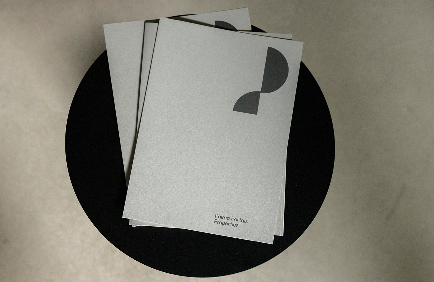
Palma Portals Properties’ printed materials exemplify the adaptability of the brand’s visual identity. Whether the logo is placed in the corner of a document or centered on promotional collateral, it always maintains its integrity, showcasing the brand’s commitment to quality and precision.
Whitespace for minimalist design approach
The use of ample whitespace around the emblem in Palma Portals Properties’ printed materials further emphasizes its minimalist design approach. This whitespace allows the emblem and accompanying text to stand out and breathe, creating a clean and sophisticated aesthetic.
This image is property of lh4.googleusercontent.com.
Functionality of the Design
Memorability and versatility
A well-designed visual identity should not only be memorable but also versatile. Presa’s design for Palma Portals Properties achieves both of these objectives by focusing on elemental geometric shapes. This choice encapsulates the brand’s core values and commitment to architectural brilliance, ensuring a visual identity that resonates with audiences and remains timeless.
Capturing core values and commitment to architectural brilliance
Every element of Palma Portals Properties’ visual identity has been strategically chosen to capture the brand’s core values and commitment to architectural brilliance. Through the use of minimalist design, Presa has created a visual identity that portrays the company’s dedication to quality and timeless design.
Simplicity and Clarity in Communication
The power of simplicity in branding
Palma Portals Properties’ branding is a testament to the power of simplicity in effective communication. By stripping away unnecessary elements and focusing on minimalism, the brand conveys its message clearly and powerfully. This simplicity allows the audience to understand and appreciate the brand’s dedication to quality and timeless design.
Portraying commitment to quality and timeless design
Through its minimalist branding approach, Palma Portals Properties effectively portrays its commitment to quality and timeless design. The visual identity speaks volumes about the brand’s emphasis on precision, elegance, and long-lasting value.

This image is property of abduzeedo.com.
Conclusion
Summary of Palma Portals Properties’ branding
Palma Portals Properties’ branding is a shining example of how simplicity and minimalism can create a powerful and communicative visual identity. Through the use of pure geometric shapes, a neutral color palette, and a minimalist design approach, Palma Portals Properties effectively captures its commitment to quality construction and timeless design.
Enrique Presa’s reminder of less is more in design
Enrique Presa’s work for Palma Portals Properties serves as a gentle reminder that in the world of design, less is often more. By embracing simplicity and minimalism, Presa has created a visual identity that not only resonates with audiences but also stands the test of time. His genius lies in his ability to distill complex concepts into visually stunning and impactful designs.
Source: https://abduzeedo.com/palma-portals-properties-minimalist-approach-branding-and-visual-identity