
Review: PATCH Branding by Laurianne Froesel
When it comes to design, you often come across branding efforts that truly stand out. PATCH Branding, designed by Laurianne Froesel, is an exceptional example of innovation, clarity, and visual appeal. PATCH is a platform that allows individual designers and small businesses to transform their ideas into polished designs without having to order in bulk. The branding is characterized by a minimalist logo with a unique bulge effect that adds a touch of dynamism. The secondary logos show Laurianne’s design versatility, allowing for seamless integration into various platforms. The distilled version of the logo, which features the letter ‘P’ standing alone, demonstrates an understanding of modern digital necessities. Ultimately, the design for PATCH by Laurianne Froesel strikes a perfect balance between simplicity and innovation, reflecting the brand’s mission and establishing a strong visual presence in the design world.
This image is property of lh4.googleusercontent.com.
Overview
PATCH Branding by Laurianne Froesel is a remarkable example of innovative, clear, and visually appealing branding. This branding aims to empower individual designers and emerging small businesses by helping them transform their initial ideas into polished final designs. PATCH differentiates itself by delivering high-quality products without requiring creators to order in bulk, ensuring affordability without compromising on design integrity.
The heart of PATCH’s visual identity lies in its minimalist yet striking logo design. The logo features a super bold sans-serif font and incorporates a subtle bulge effect, adding a touch of uniqueness and creating a dynamic visual presence.

This image is property of lh6.googleusercontent.com.
Visual Identity
Logo Design
The logo design for PATCH is simple yet impactful. It utilizes a bold sans-serif font that exudes confidence. What sets it apart is the subtle bulge effect applied to the typography, giving the logo a dynamic feel. This deviation from traditional solid fonts adds a touch of uniqueness and makes the logo memorable. The minimalist design and bold typography create a strong visual presence for the brand.
Typography
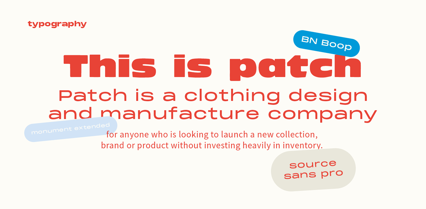
The typography used in PATCH’s visual identity is a super bold sans-serif font. This choice of font enhances the confidence and boldness of the brand. The simplicity of the font allows it to be easily readable and recognizable in various applications. The boldness of the typography adds to the strong visual impact of the branding and helps it stand out in a crowded marketplace.
Color Palette
PATCH’s color palette consists of blue, red, and white. These colors are classic and versatile, allowing for various interpretations and applications. The blue symbolizes trust and reliability, while the red represents energy and passion. The combination of these colors, along with the white background, creates a clean and professional look. The color palette adds depth and visual interest to the branding, making it visually appealing and memorable.
Secondary Logos
One of the notable elements of PATCH’s branding is the use of secondary logos. These secondary logos are not mere variations but reinterpretations of the primary logo. They draw from the same color palette of blue, red, and white but showcase different compositions and arrangements. Whether it’s utilizing thick strokes or placing the logo within diverse shapes to produce a crest-like emblem, each secondary logo speaks to a different audience while maintaining the essence of the PATCH brand. The versatility of these secondary logos allows for seamless integration into various platforms and promotional materials.
Distilled Version of the Logo
PATCH also features a distilled version of the logo where the letter ‘P’ stands alone, representing the brand. This simplified version is designed with modern digital necessities in mind and finds its perfect place in app icons. The inclusion of a distilled version of the logo showcases the foresight of the designer in understanding the importance of adaptability and versatility in contemporary branding.

This image is property of abduzeedo.com.
Branding Artifacts
Overview of Branding Artifacts
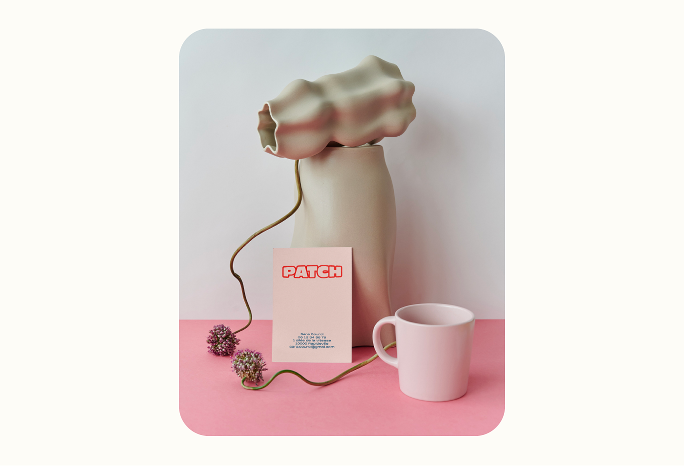
PATCH’s branding encompasses a range of artifacts that contribute to its overall visual identity. These artifacts include but are not limited to business cards, stationery, packaging labels, promotional materials, and digital assets. The coherent use of the logo, typography, and color palette across these artifacts reinforces the brand’s consistency and establishes a strong visual presence in the design world.
Examples of Branding Artifacts
PATCH’s branding artifacts reflect the meticulous attention to detail and aesthetic consideration that went into the design process. Business cards feature the logo prominently, providing a memorable first impression. Stationery and packaging labels showcase the brand’s minimalist and bold visual identity, creating a cohesive and professional look. Promotional materials, such as stickers and banners, utilize the secondary logos and color palette to attract and engage the target audience. The digital assets, including social media graphics and website designs, effectively translate the branding into the digital space, ensuring a consistent and recognizable presence across platforms.
This image is property of lh6.googleusercontent.com.
Conclusion
Summary of PATCH Branding
In summary, PATCH Branding by Laurianne Froesel is a harmonious blend of simplicity and innovation. The bold typography, versatile color palette, and versatile secondary logos create a strong and visually appealing visual identity. The cohesive use of branding artifacts across various platforms further reinforces the brand’s consistency and impact.
Effectiveness and Impact
The effectiveness and impact of PATCH’s branding lie in its ability to communicate the brand’s mission and values clearly and memorably. The boldness and uniqueness of the logo design make it easily recognizable and memorable. The versatile secondary logos ensure that the brand can adapt to different contexts and engage diverse target audiences. The comprehensive range of branding artifacts reinforces the brand’s professionalism and consistency, creating a lasting and impactful impression.
Importance of Design in Branding
The importance of design in branding cannot be overstated. Effective branding not only helps businesses stand out in a competitive market but also communicates their values, mission, and identity to customers. Design plays a pivotal role in creating a strong and cohesive visual identity that resonates with the target audience. PATCH Branding by Laurianne Froesel exemplifies the significance of design in branding by incorporating innovative design elements, strategic color choices, and versatile branding artifacts. Through thoughtful design, PATCH has established a strong visual presence and an effective platform for creators and businesses to bring their concepts to life.

This image is property of lh3.googleusercontent.com.
Source: https://abduzeedo.com/review-patch-branding-laurianne-froesel